1
我有一些关于价格和回归的需求(数量)方程的数据。下面是重复性数据的dput():当我更换x-lim时,我的抛物线沿着x轴移动
https://gist.github.com/hack-r/28d0f6845eafc7935f6cbb74fdd09637
我试图让一个情节,看起来像这一个,这样我就知道价格最优在于:

但是,我从上面得到的图的example没有提供它的数据并且省略了一些代码,所以我不清楚它们是如何得到它的。
我的数据是这样的:
head(mydat)
gross_price  cost quantity net_price
204  895.000 47.51235  16 847.4877
159  920.000 66.10084  3 853.8992
149  950.000 75.67797  6 874.3220
201  895.000 13.03794  10 881.9621
217 1016.329 114.95628  9 901.3731
288 1132.306 90.63706  16 1041.6690
所以,我这样做:
par(mar = c(5,5,2,5))

with(mydat, plot(net_price, quantity,pch=1,xlab="Price",ylab="Quantity", xlim=c(0,1250),ylim=c(0,800)))
abline(a=(30.6117202), b=-0.0279182, col="green") # Demand Fn coef.s from regression

par(new = T)
mydat$predicted_q <- (30.6117202-0.0279182 * mydat$net_price)
mydat$profit  <- mydat$predicted_q * mydat$net_price # quantity * net price

with(mydat, plot(net_price, profit, type="l", col="red3",axes=F, xlab=NA, ylab=NA))
这给了我这样的:
- 注意:在撰写本文时,Stack Overflow的图像主机(imgur.com)发生重大中断,所以我无法正确显示图形,因此链接。
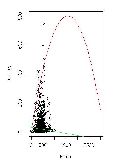
但它看起来像红线(抛物线)有点正确的中心,所以我试着改变xlim看看发生了什么。显然抛物线停留在同一个地方,而不管其余的数据如何。这不好;这意味着我们无法正确理解情节。
par(mar = c(5,5,2,5))

with(mydat, plot(net_price, quantity,pch=1,xlab="Price",ylab="Quantity", xlim=c(0,3000),ylim=c(0,800)))
abline(a=(30.6117202), b=-0.0279182, col="green") # Demand Fn coef.s from regression

par(new = T)
mydat$predicted_q <- (30.6117202-0.0279182 * mydat$net_price)
mydat$profit  <- mydat$predicted_q * mydat$net_price # quantity * net price

with(mydat, plot(net_price, profit, type="l", col="red3",axes=F, xlab=NA, ylab=NA))
http://imageshack.com/a/img923/6971/r1gG6I.png
所以我想对自己说,这个问题必须是抛物线被绘出了从其余部分不同的层上,也许我可以lines()解决这个问题:
par(mar = c(5,5,2,5))

with(mydat, plot(net_price, quantity,pch=1,xlab="Price",ylab="Quantity", xlim=c(0,3000),ylim=c(0,800)))
abline(a=(30.6117202), b=-0.0279182, col="green") # Demand Fn coef.s from regression

par(new = T)
mydat$predicted_q <- (30.6117202-0.0279182 * mydat$net_price)
mydat$profit  <- mydat$predicted_q * mydat$net_price # quantity * net price

#with(mydat, plot(net_price, profit, type="l", col="red3",axes=F, xlab=NA, ylab=NA))
lines(mydat$profit, col="red3",type="l")
但是,这个结果甚至不是一个很好的光滑的抛物线,这是我需要这个有用的...
是啊,这是有道理的!我要告诉自己,如果不是我以此为基础的坏榜样,我会意识到这一点。 –
如果你设置了'axes = T',你就会意识到抛物线有不同的轴。 –
没错。或'axis(side = 4)'。我只是盲目地跟随这个例子。我不认为我使用的示例的OP知道这个问题。 –