2014-09-29 82 views
5

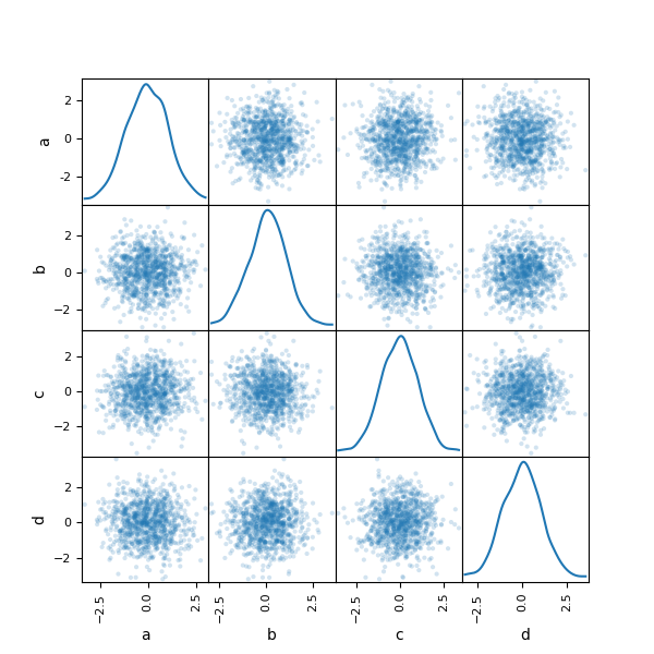
我正在用Pandas绘制一个散点图矩阵,但第一个绘图的刻度标签有时会被正确绘制,有时会被错误地绘制。我无法弄清楚什么是错的!散点图中的刻度线标签与熊猫的绘制不正确

下面是一个例子:

enter image description here

代码:

from pandas.tools.plotting import scatter_matrix 
import pylab 
import numpy as np 
import pandas as pd 

def create_scatterplot_matix(X, name):  
    """ 
    Outputs a scatterplot matrix for a design matrix. 

    Parameters: 
    ----------- 
    X:a design matrix where each column is a feature and each row is an observation. 
    name: the name of the plot. 
    """ 
    pylab.figure() 
    df = pd.DataFrame(X) 
    axs = scatter_matrix(df, alpha=0.2, diagonal='kde') 

    for ax in axs[:,0]: # the left boundary 
     ax.grid('off', axis='both') 
     ax.set_yticks([0, .5]) 

    for ax in axs[-1,:]: # the lower boundary 
     ax.grid('off', axis='both') 
     ax.set_xticks([0, .5]) 

    pylab.savefig(name + ".png") 

家伙,任何人!

编辑(X的例子):

X = np.random.randn(1000000, 10) 
+2

你有一个设计矩阵'X'的例子吗?例如,可以使用一组随机值轻松创建一个。这样可以更容易在本地尝试。 – Evert 2014-10-07 15:31:16

+0

@Evert请参阅编辑。 – 2014-10-13 15:45:40

回答

2

这是预期的行为。 y轴值显示第0列的y轴值。第0行第0列包含概率密度图。第0行,第1至第3列包含用于在对角线上创建图形的数据。

在Pandas Plotting文档中的example看起来类似。

示范:

from pandas.tools.plotting import scatter_matrix 
import pylab 
import numpy as np 
import pandas as pd 

def create_scatterplot_matix(X, name):  
    pylab.figure() 

    df = pd.DataFrame(X) 
    axs = scatter_matrix(df, alpha=0.2, diagonal='kde') 

    pylab.savefig(name + ".png") 

create_scatterplot_matix([[0,0,0,0] 
         ,[1,1,1,1] 
         ,[1,1,1,1] 
         ,[2,2,2,2]],'test') 

在这个例子中的代码,我已经用于演示一个非常简单的数据集。我也删除了设置y和x滴答的代码段。

这是所得到的曲线图:

enter image description here

在每个对角线的是概率密度曲线图。在每个非对角线中用于创建对角线图的数据。第0行的y轴显示位于第0,0位置的概率密度图的y轴。第1行,第2行和第3行的y轴显示了用于在对角线上创建概率密度图的0,1,0,2和0,3位置的数据的y轴。

您可以在我们的示例中看到以下绘制点:[0,0] [1,1] [2,2]。 [1,1]处的点较暗,因为此处的点数多于其他点的点数。

发生了什么是你的数据集,所有的值都在0和1之间,这就是为什么0.5在两个轴上完全显示在行/列的中心。然而,数据严重倾向于0值,这就是为什么概率密度图峰值越接近0就越好。第0行的概率密度图的最大值看起来像是(眼球测试)大约8 -10。

我会亲自做的是编辑您的左边界的代码是这样的:

autoscale = True # We want the 0,0th item's y-axis to autoscale 
for ax in axs[:,0]: # the left boundary 
    ax.grid('off', axis='both') 
    if autoscale == True:  
     ax.set_autoscale_on(True) 
     autoscale = False 
    else: 
     ax.set_yticks([0, 0.5]) 

在本例中的数据集,使用这种技术产生这样的图表:

enter image description here

0

这似乎是熊猫中的一个错误。请参阅https://github.com/pydata/pandas/issues/5662

与此同时,您可以手动调整标签。首先,根据内核密度图中的范围设置标签的数量和所需的间隔。

axs[0,0].set_yticks([0.24,0.33,0.42]) 

然后手动更改标签中的文字。

axs[0,0].set_yticklabels([0.0, 1.0, 2.0])