0
我拼命试图代码按钮:如何创建一个阴影和透明填充,让阴影出现的边框
任何人可以帮助我吗?谢谢。
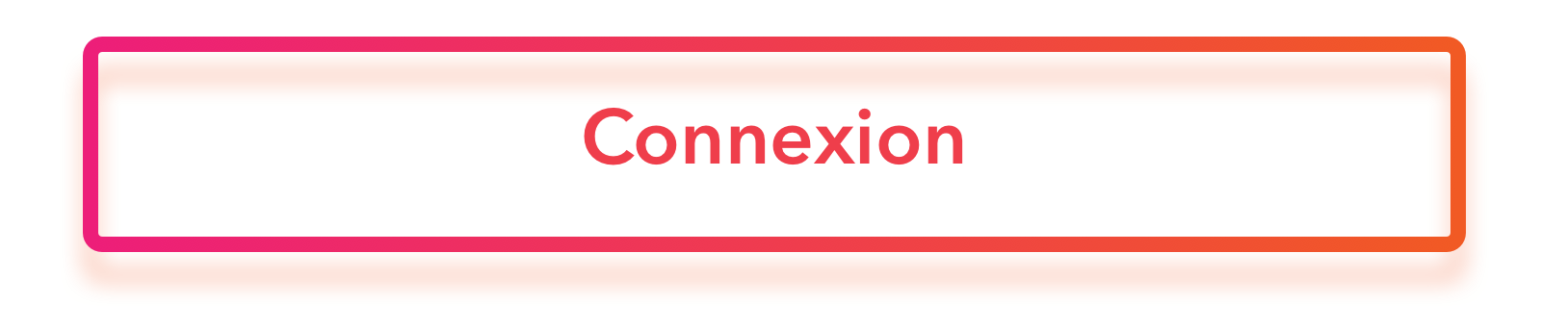
我试图做一个简单的按钮box-shadow,一个边框和透明背景,但似乎不可能。
所以你可以看到在这个其他codepen一个尝试和其他:after和:before接近但似乎没有工作。
我拼命试图代码按钮:如何创建一个阴影和透明填充,让阴影出现的边框
任何人可以帮助我吗?谢谢。
我试图做一个简单的按钮box-shadow,一个边框和透明背景,但似乎不可能。
所以你可以看到在这个其他codepen一个尝试和其他:after和:before接近但似乎没有工作。
我发现这样做的最佳方式是使用伪元素并在其上应用模糊的边框。
.border-shadow {
    position: relative;
    display: inline-block;
    border: 3px solid #F01476;
    padding: 20px;
    background-color: transparent;

    &:after {
     content: '';
     position: absolute;
     top: 0;
     right: 0;
     bottom: 0;
     left: 0;
     outline: 3px solid #F01476;
     filter: blur(2px);
     transform: translateY(5px);
    }
}
如果你想有一个边界梯度,那么你可以做这样的事情:
.border-shadow {
    position: relative;
    display: inline-block;
    padding: 20px;
    background-color: transparent;

    &:after {
     content: '';
     position: absolute;
     top: -3px;
     right: -3px;
     bottom: -3px;
     left: -3px;
     filter: blur(2px);
     transform: translateY(5px);
    }

    &, &:after {
     border-image: url("data:image/svg+xml;utf8,<svg xmlns='http://www.w3.org/2000/svg' width='50' height='50'><defs><linearGradient id='redgradient'><stop offset='0' stop-color='%23F01476'/><stop offset='1' stop-color='%23F3590F'/></linearGradient></defs><g id='Layer_1'><path d='M0,0 L50,0 L50,50 L0,50 L0,0 z' fill='url(%23redgradient)' width='100%' height='100%'/></g></svg>") 10% stretch;
    }
}
See the jsfiddle for both examples in action
注:这是前缀的CSS,所以正确的浏览器支持,你会想应用适当的前缀。如果可能的话,我建议使用autoprefixer来处理这个问题。
非常欢迎@loan。随意标记这个答案为接受,如果它做你想在这里。 – fredrivett
我做不到。我的投票被记录,但没有显示,因为我的声望不到15。但再次感谢! – loan
要将它标记为已接受,请使用vote @loan下的勾号按钮。乐于帮助! – fredrivett
https://codepen.io/tranduy/pen/mMorGp – loan