-2
我有14个菜单,我想根据屏幕分辨率大小设置这些菜单。如果屏幕分辨率为size <= 1280px以上的菜单将会显示在菜单栏中,其他菜单将会在more菜单中显示下拉菜单。 (如在所附截屏)根据屏幕分辨率显示菜单
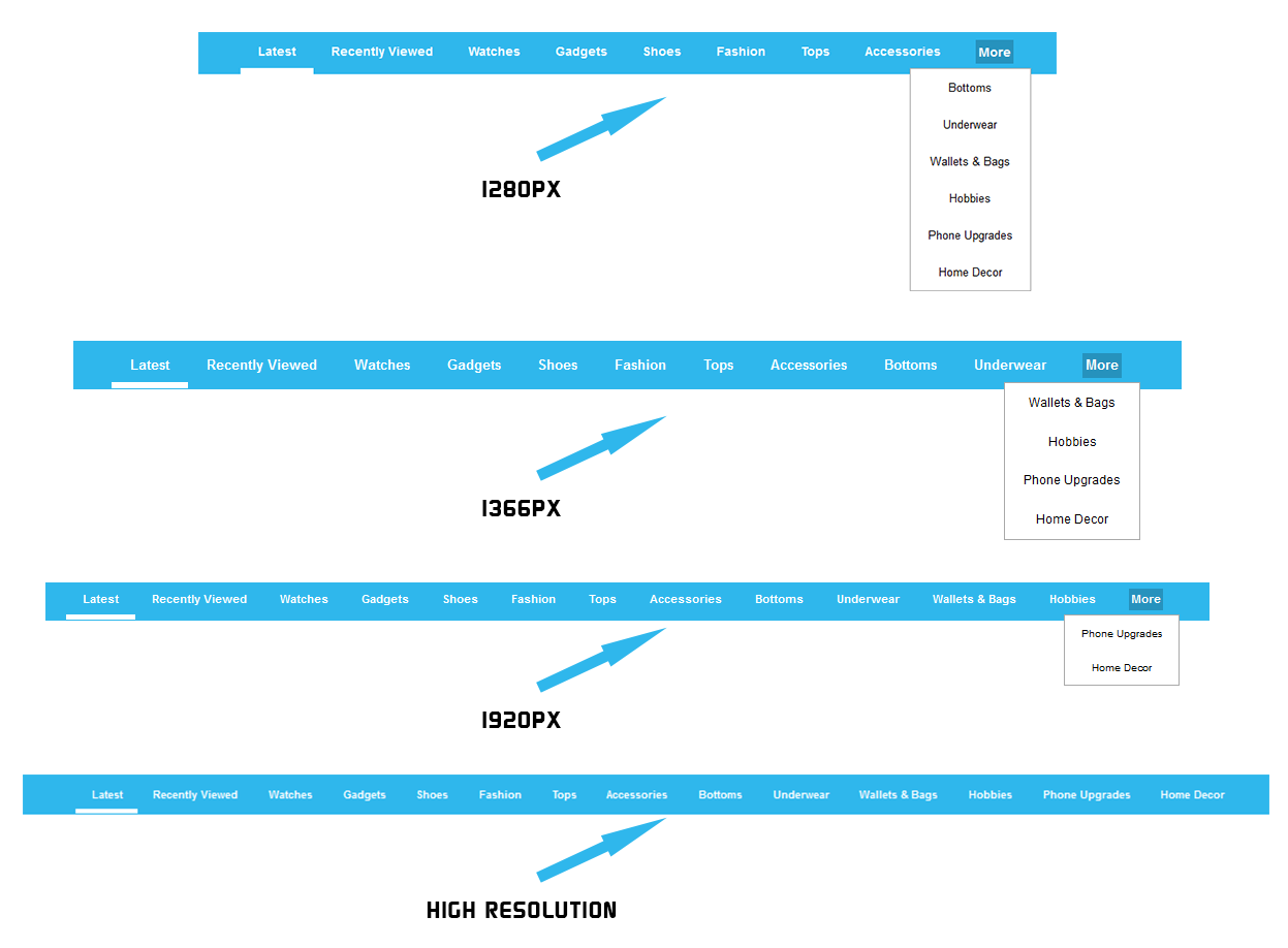
我有14个菜单,我想根据屏幕分辨率大小设置这些菜单。如果屏幕分辨率为size <= 1280px以上的菜单将会显示在菜单栏中,其他菜单将会在more菜单中显示下拉菜单。 (如在所附截屏)根据屏幕分辨率显示菜单
给你:
<!DOCTYPE html>

<html>

<head>

<style>

body {margin:0;}

ul.topnav {

    list-style-type: none;

    margin: 0;

    padding: 0;

    overflow: hidden;

    background-color: #333;

}


ul.topnav li {float: left;}


ul.topnav li a {

    display: inline-block;

    color: #f2f2f2;

    text-align: center;

    padding: 14px 16px;

    text-decoration: none;

    transition: 0.3s;

    font-size: 17px;

}


ul.topnav li a:hover {background-color: #555;}


ul.topnav li.icon {display: none;}


@media screen and (max-width:680px) {

    ul.topnav li:not(:first-child) {display: none;}

    ul.topnav li.icon {

    float: right;

    display: inline-block;

    }

}


@media screen and (max-width:680px) {

    ul.topnav.responsive {position: relative;}

    ul.topnav.responsive li.icon {

    position: absolute;

    right: 0;

    top: 0;

    }

    ul.topnav.responsive li {

    float: none;

    display: inline;

    }

    ul.topnav.responsive li a {

    display: block;

    text-align: left;

    }

}

</style>

</head>

<body>


<ul class="topnav" id="myTopnav">

    <li><a class="active" href="#home">Home</a></li>

    <li><a href="#news">News</a></li>

    <li><a href="#contact">Contact</a></li>

    <li><a href="#about">About</a></li>

    <li class="icon">

    <a href="javascript:void(0);" style="font-size:15px;" onclick="myFunction()">☰</a>

    </li>

</ul>


<div style="padding-left:16px">

    <h2>Responsive Topnav Example</h2>

    <p>Resize the browser window to see how it works.</p>

</div>


<script>

function myFunction() {

    var x = document.getElementById("myTopnav");

    if (x.className === "topnav") {

     x.className += " responsive";

    } else {

     x.className = "topnav";

    }

}

</script>


</body>

</html>他并没有要求这样的菜单../他无法将菜单包裹得更多。 –
许多方法来解决一个问题的家伙。他只问“请建议我该怎么做”。 – ThinhLe
只写菜单选项:
<ul class="flex menu">
    <li><a href="page.html">Menu Item</a></li>
    <!-- more list items... -->
</ul>
并初始化菜单:
$('ul.menu.flex').flexMenu();
附上flexmenu.js,这里是一个demo。
感谢它为我工作 –
向我们展示您到目前为止所尝试的代码。 – aavrug
我仍然没有为此编写代码。首先我需要建议如何实现这件事。 –