0
我试图得到一个完整的屏幕高度的着陆页是这样一个 http://themeforest.net/item/de7igner-flat-ios7-inspired-coming-soon-template/full_screen_preview/5800714全屏登陆页面高度100%不工作
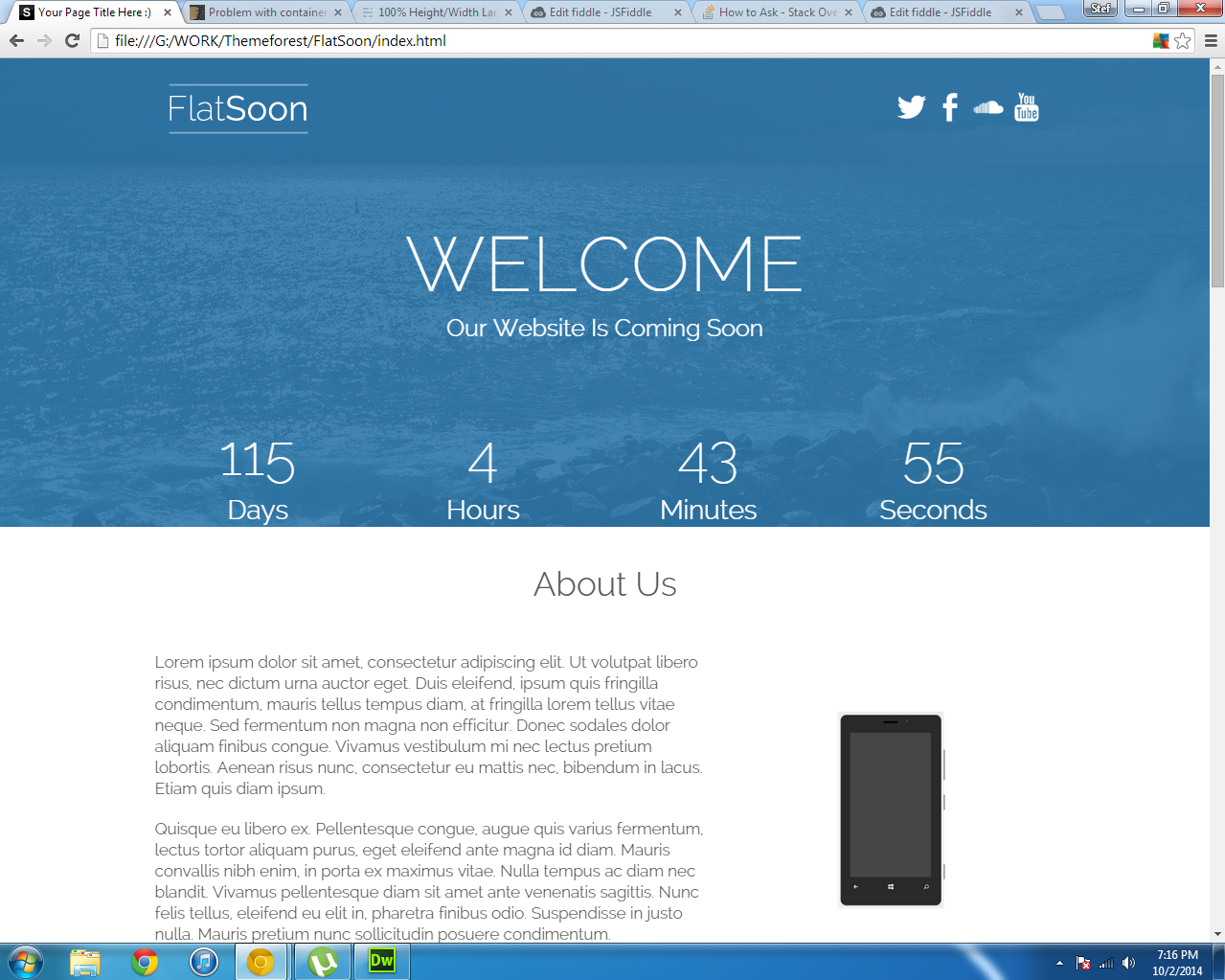
但我得到这个
这是我的代码
<div class="wrapper">
     <div class="headerbg">
     <header>

      <div class="container">

       <div class="topheader wow fadeInDown">
        <img src="images/logo.png">

        <ul>
         <li><a href="#"><img src="icons/twitter.png"></a></li>
         <li><a href="#"><img src="icons/facebook.png"></a></li>
         <li><a href="#"><img src="icons/soundcloud.png"></a></li>
         <li><a href="#"><img src="icons/youtube.png"></a></li>
        </ul>
       </div>

       <div class="wow fadeIn">
        <h1>Welcome</h1>
        <h2>Our Website Is Coming Soon</h2>
       </div>

       <div class="wow fadeInUp">
        <div id="defaultCountdown"></div>
       </div>

      </div>

     </header>
     </div>
    </div>
和我的CSS:
/*-----------------------------------------------------------------------------------------------------------------
            Header
---------------------------------------------------------------------------------------------------------------- */

.wrapper {
    width: 100%;
    min-height: 100%;
}


.headerbg {
    background: url(../images/bg.jpg) no-repeat center center fixed;
    -webkit-background-size: cover;
    -moz-background-size: cover;
    -o-background-size: cover;
    background-size: cover;
    min-height:100%;
}

header .container {
    background:none;
}

.topheader {
    height:100px;
    margin:0;
}
.topheader img {
    float:left;
}

.topheader ul {
    float:right;
    padding-right: 20px;
    line-height:100px;
    color:#fff;
}

.topheader li {
    display:inline;
}
.topheader li img {
    width:40px;
    height:40px;
    padding-top:30px;


    -webkit-transition: all 0.4s;
    -moz-transition: all 0.4s;
    transition: all 0.4s;
}

.topheader li img:hover {
    opacity:0.5;
}


header h1 {
    font-size:80px;
    line-height:80px;
    color:#fff;
    text-align:center;
    font-family: 'Raleway', sans-serif;
    font-weight:100;
    padding-top:75px;
    text-transform:uppercase;
    padding-bottom:0;
}

header h2 {
    font-size:25px;
    line-height:25px;
    color:#fff;
    text-align:center;
    font-family: 'Raleway', sans-serif;
    font-weight:300;
    padding-top:0px;
    padding-bottom:50px;
}

@media only screen and (max-width: 767px) {

header {
    height:500px;
    width:100%;
}


header h1 {
    font-size:40px;
    line-height:40px;
    color:#fff;
    text-align:center;
    font-family: 'Raleway', sans-serif;
    font-weight:100;
    padding-top:40px;
    text-transform:uppercase;
    padding-bottom:0px;
}

header h2 {
    font-size:20px;
    line-height:20px;
    color:#fff;
    text-align:center;
    font-family: 'Raleway', sans-serif;
    font-weight:300;
    padding-right:10px;
    padding-left:10px;
    padding-top:0px;
}

.topheader li img {
    width:30px;
    height:30px;
    padding-top:30px;
}

.topheader {
    height:75px;
    margin:0;
}
.topheader img {
    width:150px;
    height:75px;
}


}
没有,没有工作:( – 2014-10-02 22:25:58
在这种情况下,你可以提供一个jsfiddle? – kba 2014-10-02 22:26:33
不客气。 :-) – kba 2014-10-02 23:29:02