0
我有三列布局。我的中心div是我的主要内容区域。我希望当我的内容不宽时,这个div会横向扩展以充分利用可用空间,尽管不是很关键,但它也可以垂直拉伸。我使用在线布局generator来创建这种风格。看到附加的图像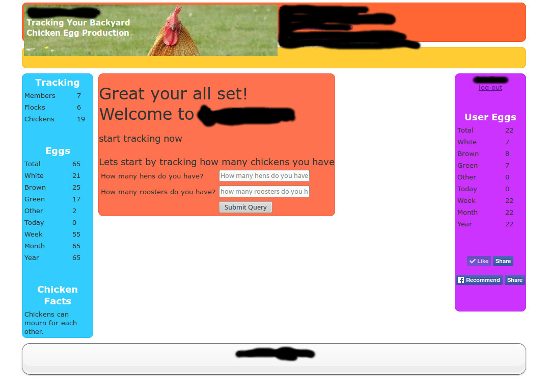 css如何拉伸中心div来填充允许区域
任何帮助将是apreciated。
<!DOCTYPE html>
<html>

<head>
<title>CSS Portal - Layout</title>
<!--[if IE]><script src="http://html5shiv.googlecode.com/svn/trunk/html5.js"></script><![endif]-->
<STYLE>
/* Generated by http://www.cssportal.com */

@import url("reset.css");

body {
    font-family: Verdana, Arial, Helvetica, sans-serif;
    font-size: 13px;
    color:#333
}

p {
    padding: 10px;
}

#wrapper {
    width: 100%;
    min-width: 600px;
    max-width: 1000px;
    margin: 0 auto;
}

#headerwrap {
    width: 100%;
    float: left;
    margin: 0 auto;
}

#header {
    height: 75px;
    background: #FF6633;
    border-radius: 10px;
    border: 1px solid #eb521f;
    margin: 5px;
}

#navigationwrap {
    width: 100%;
    float: left;
    margin: 0 auto;
}

#navigation {
    height: 40px;
    background: #FFCC33;
    border-radius: 10px;
    border: 1px solid #ebb81f;
    margin: 5px;
}

#contentliquid {
    float: left;
    width: 100%;
}

#contentwrap {
    margin-left: 150px;
    margin-right: 150px;
    float: left;
}

#content {
    background: #FF724F;
    border-radius: 10px;
    border: 1px solid #eb5e3b;
    margin: 5px;
}

#leftcolumnwrap {
    width: 150px;
    margin-left:-100%;
    float: left;
}

#leftcolumn {
    background: #33CCFF;
    border-radius: 10px;
    border: 1px solid #1fb8eb;
    margin: 5px;
}

#rightcolumnwrap {
    width: 150px;
    margin-left: -150px;
    float: left;
}

#rightcolumn {
    background: #CC33FF;
    border-radius: 10px;
    border: 1px solid #b81feb;
    margin: 5px;
}

#footerwrap {
    width: 100%;
    float: left;
    margin: 0 auto;
    clear: both;
}

#footer {
    height: 40px;
    background: #33FF66;
    border-radius: 10px;
    border: 1px solid #1feb52;
    margin: 5px;
}
</STYLE>
</head>
<body>
    <div id="wrapper">
     <div id="headerwrap">
     <div id="header">

      <?PHP include 'header_page.php'; ?>
     </div>
     </div>
     <div id="navigationwrap">
     <div id="navigation">


     </div>
     </div>
     <div id="contentliquid"><div id="contentwrap">
     <div id="content">

      <?PHP include 'main.php'; ?>

     </div>
     </div></div>
     <div id="leftcolumnwrap">
     <div id="leftcolumn">

      <?PHP include 'left.php'; ?>
     </div>
     </div>
     <div id="rightcolumnwrap">
     <div id="rightcolumn">

      <?PHP include 'right.php'; ?>
     </div>
     </div>
     <div id="footerwrap">
     <div id="footer">

      <?PHP include 'footer.php'; ?>
     </div>
     </div>
    </div>
</body>
</html>
请认真阅读并发布您的jsfiddle。 – Alex
使用相对宽度,而不是使用像素(如宽度:150像素)使用百分比(如宽度:20%)。为了让你开始:http://webdesignerwall.com/tutorials/5-useful-css-tricks-for-responsive-design –