0
我想达到以下布局上的图片,如图所示: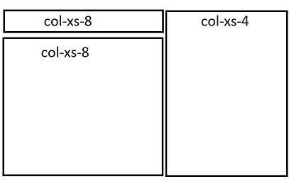 引导网格和行对齐问题
我想这两个COL-XS-8和COL-XS-4在同样的高度开始,所以我把它们放在一行中,而下面的col-xs-8放到另一行中。我得到的是以下内容: 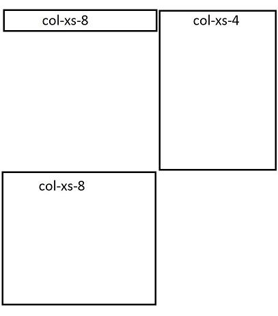
有什么办法可以解决此问题并正确显示两个列吗?我也想让两列完全一样高。较低的col-xs-8具有固定的高度。谢谢!
我想达到以下布局上的图片,如图所示:引导网格和行对齐问题
我想这两个COL-XS-8和COL-XS-4在同样的高度开始,所以我把它们放在一行中,而下面的col-xs-8放到另一行中。我得到的是以下内容:
有什么办法可以解决此问题并正确显示两个列吗?我也想让两列完全一样高。较低的col-xs-8具有固定的高度。谢谢!
添加pull-right类到第二元件。该类为元素添加float:right;属性。
<link href="https://maxcdn.bootstrapcdn.com/bootstrap/3.3.6/css/bootstrap.min.css" rel="stylesheet" />

<div class="row">

    <div class="col-xs-4 bg-warning">Lorem Ipsum is simply dummy text.</div>

    <div class="col-xs-8 bg-primary pull-right">Lorem Ipsum is simply dummy text of the printing and typesetting industry. Lorem Ipsum has been the industry's standard dummy text ever since the 1500s, when an unknown printer took a galley of type and scrambled it to make a type specimen book. It has survived not only five centuries, but also the leap into electronic typesetting, remaining essentially unchanged. It was popularised in the 1960s with the release of Letraset sheets containing Lorem Ipsum passages, and more recently with desktop publishing software like Aldus PageMaker including versions of Lorem Ipsum.</div>

    <div class="col-xs-4 bg-success">Lorem Ipsum is simply dummy text of the printing and typesetting industry. Lorem Ipsum has been the industry's standard dummy text ever since the 1500s, when an unknown printer took a galley of type and scrambled it to make a type specimen book. It has survived not only five centuries, but also the leap into electronic typesetting, remaining essentially unchanged. It was popularised in the 1960s with the release of Letraset sheets containing Lorem Ipsum passages, and more recently with desktop publishing software like Aldus PageMaker including versions of Lorem Ipsum.</div>

</div><div class ='row'>
<div class='col-md-8'>
<div style='background:green' class='col-md-12'>a</div>
<div style='background:yellow' class='col-md-12'>b</div>
</div>
<div class='col-md-4'>
<div style='background:red' class='col-md-12'>c</div>
</div>
</div>
它不为我工作,我有两行,在这个小提琴:https://jsfiddle.net/pcnjw6ud/ – donfrigo
试试这个代码,看看bootplay链接:
<div class="row-fluid">
    <div class="container">
    <div class="col-lg-8 col-md-8 col-sm-12 col-xs-12">
     <div class="col-lg-12 col-md-12 col-sm-12 col-xs-12 test">
     col-8
     </div>
     <div class="col-lg-12 col-md-12 col-sm-12 col-xs-12 test1">
     col-8
     </div>
    </div>
    <div class="col-lg-4 col-md-4 col-sm-12 col-xs-12">
     <div class="col-lg-12 col-md-12 col-sm-12 col-xs-12 test2">
     col-4
     </div>
    </div>
    </div>
</div>
/* CSS将bootstrap.css后应用*/
.test {
    background-color: #ff0000;
    border: 1px solid;
    color: #ffffff;
}
.test1 {
    background-color: #000000;
    border: 1px solid;
    color: #ffffff;
}
.test2 {
    background-color: #008000;
    border: 1px solid;
    color: #ffffff;
}
您可以使用此代码并根据您对每列的需要应用高度。
<link rel="stylesheet" href="http://maxcdn.bootstrapcdn.com/bootstrap/3.3.6/css/bootstrap.min.css">

<div class="row">

    <div class="col-xs-8" style="background-color:lavender;">

     <div class="row">

      <div class="col-xs-12" style="background-color:lavenderblush;height:50px;">col-xs-8</div>

      <div class="col-xs-12" style="background-color:lavenderblush;height:50px;">col-xs-8</div>

     </div>

    </div>


    <div class="col-xs-4" style="background-color:lavenderblush;height:100px;">col-xs-4</div>

</div><link href="https://maxcdn.bootstrapcdn.com/bootstrap/3.3.6/css/bootstrap.min.css" rel="stylesheet" />
<div class ='row'>
<div class='col-xs-12'>
<div class="col-xs-8" style="height:50px;background:red">col-xs-8</div>
<div class="col-xs-4 pull-right" style="background:green;height:200px">col-xs-4</div>
<div class="col-xs-8" style="background:yellow;height:150px">col-xs-8</div>
</div>
</div>
完美, 谢谢! (: – donfrigo