2016-03-01 150 views
0

首先,这是在.NET 4.0中,因为它必须是。我知道.NET的后续版本中已经修复了一些错误,所以如果这是一个实际的.NET错误,我想我将不得不忍受使用似乎没有这个问题的用户控件。WPF自定义控件按钮内容缺少多个按钮

我在WPF中创建了一个自定义控件库,以便在第三方软件中使用可定制的按钮。但是,我似乎遇到了一个问题,即使用多个按钮导致所有按钮的内容都会丢失。我已经在SNOOP中确认了这个问题。内容只是不存在。 SNOOP树的内容与主持人一样远,除此之外没有任何内容,除了一个有内容的按钮。我创建了一个非常简单的问题示例。

我的图书馆Generic.xaml如下:

<ResourceDictionary 
xmlns="http://schemas.microsoft.com/winfx/2006/xaml/presentation" 
xmlns:x="http://schemas.microsoft.com/winfx/2006/xaml" 
xmlns:controls="clr-namespace:CustomControlsLibrary.Controls"> 

<Style x:Key="CustomButtonStyle" TargetType="{x:Type controls:CustomButton}"> 
    <Setter Property="FontSize" Value="16" /> 
    <Setter Property="FontWeight" Value="Bold" /> 
    <Setter Property="Template"> 
     <Setter.Value> 
      <ControlTemplate TargetType="{x:Type controls:CustomButton}"> 
       <Border CornerRadius="{TemplateBinding CornerRadius}" BorderThickness="3" BorderBrush="{TemplateBinding BorderBrush}" Background="{TemplateBinding Background}"> 
        <ContentPresenter HorizontalAlignment="Center" VerticalAlignment="Center" ContentSource="Content" /> 
       </Border> 
      </ControlTemplate> 
     </Setter.Value> 
    </Setter> 
</Style> 

<Style x:Key="Button1Style" TargetType="{x:Type controls:Button1}" BasedOn="{StaticResource CustomButtonStyle}" > 
    <Setter Property="CornerRadius" Value="4" /> 
    <Setter Property="BorderBrush" Value="White" /> 
    <Setter Property="Height" Value="40" /> 
    <Setter Property="Width" Value="100" /> 
    <Setter Property="Foreground" Value="White" /> 
    <Setter Property="Content"> 
     <Setter.Value> 
      <TextBlock Text="{Binding RelativeSource={RelativeSource AncestorType=controls:Button1}, Path=Text}" /> 
     </Setter.Value> 
    </Setter> 
</Style> 

两个控制类如下:

的CustomButton:

public class CustomButton : Button 
{ 
    public static readonly DependencyProperty CornerRadiusProperty = 
     DependencyProperty.Register("CornerRadius", typeof(CornerRadius), typeof(CustomButton), new FrameworkPropertyMetadata(new CornerRadius(0))); 

    public CornerRadius CornerRadius 
    { 
     get { return (CornerRadius)GetValue(CornerRadiusProperty); } 
     set { SetValue(CornerRadiusProperty, value); } 
    } 

    static CustomButton() 
    { 
     DefaultStyleKeyProperty.OverrideMetadata(typeof(CustomButton), new FrameworkPropertyMetadata(typeof(CustomButton))); 
    } 
} 

Button1的:

public class Button1 : CustomButton 
{ 

    public static readonly DependencyProperty TextProperty = 
     DependencyProperty.Register("Text", typeof(string), typeof(Button1), new FrameworkPropertyMetadata("")); 

    public string Text 
    { 
     get { return (string)GetValue(TextProperty); } 
     set { SetValue(TextProperty, value); } 
    } 

    static Button1() 
    { 
     DefaultStyleKeyProperty.OverrideMetadata(typeof(Button1), new FrameworkPropertyMetadata(typeof(Button1))); 
    } 
} 

我然后创建只是一个主窗口一个简单的WPF应用程序与MainWindow.xaml所有的逻辑:

<Window x:Class="CustomControlLibraryTestApp.MainWindow" 
    xmlns="http://schemas.microsoft.com/winfx/2006/xaml/presentation" 
    xmlns:x="http://schemas.microsoft.com/winfx/2006/xaml" 
    xmlns:controls="clr-namespace:CustomControlsLibrary.Controls;assembly=CustomControlsLibrary" 
    Title="MainWindow" Height="350" Width="525" Background="DarkGray"> 

<Window.Resources> 
    <ResourceDictionary Source="pack://application:,,,/CustomControlsLibrary;component/Themes/Generic.xaml" /> 
</Window.Resources> 

<StackPanel> 
    <controls:Button1 Style="{StaticResource Button1Style}" Background="Red" Text="Button 1" /> 
    <controls:Button1 Style="{StaticResource Button1Style}" Background="Blue" Text="Button 2" /> 
</StackPanel> 

运行时,对按钮1的含量就不复存在了,而按钮2看起来很好。从窗口中删除按钮2会导致按钮1看起来像预期的那样。

正如前面提到的,SNOOP表示当两个按钮都存在时,按钮1的内容不在那里。

任何想法?

回答

3

我要去了反对意见扔在这里,开始与马修·麦克唐纳“临WPF在C#”一帖:

自定义控件仍然构建 您的自定义部件的有效途径可以在应用程序之间共享,但当您想要增强和定制核心控件时,它们不再是 的要求。 (至 了解这种变化是多么显着,它有助于指出本书的前身,Pro .NET 2.0 Windows Forms和自定义 C#中的控件有关于自定义控件的九个完整章节和其他章节中的其他示例。在这本书中,你已经将它制作成 它没有一个自定义控制瞄准!)

简而言之,就是不需要创建额外的按钮类来控制模板中已存在的属性。你可以像使用数据绑定或附加属性一样轻松地完成这个任务,并且与Blend等工具更加兼容。

为了说明这里的关键是为你在你的示例代码暴露出两个属性的辅助类:

public static class ButtonHelper 
{ 
    public static double GetCornerRadius(DependencyObject obj) 
    { 
     return (double)obj.GetValue(CornerRadiusProperty); 
    } 

    public static void SetCornerRadius(DependencyObject obj, double value) 
    { 
     obj.SetValue(CornerRadiusProperty, value); 
    } 

    // Using a DependencyProperty as the backing store for CornerRadius. This enables animation, styling, binding, etc... 
    public static readonly DependencyProperty CornerRadiusProperty = 
     DependencyProperty.RegisterAttached("CornerRadius", typeof(double), typeof(ButtonHelper), new PropertyMetadata(0.0)); 


    public static string GetButtonText(DependencyObject obj) 
    { 
     return (string)obj.GetValue(ButtonTextProperty); 
    } 

    public static void SetButtonText(DependencyObject obj, string value) 
    { 
     obj.SetValue(ButtonTextProperty, value); 
    } 

    // Using a DependencyProperty as the backing store for ButtonText. This enables animation, styling, binding, etc... 
    public static readonly DependencyProperty ButtonTextProperty = 
     DependencyProperty.RegisterAttached("ButtonText", typeof(string), typeof(ButtonHelper), new PropertyMetadata("")); 

} 

现在马上就可以创建两个风格,每一个你的按钮类型,即绑定内部对这些属性:

<Style x:Key="RoundedButtonStyle" TargetType="{x:Type Button}" > 
     <Setter Property="Margin" Value="10" /> 
     <Setter Property="HorizontalAlignment" Value="Left" /> 
     <Setter Property="VerticalAlignment" Value="Center" /> 
     <Setter Property="Foreground" Value="White" /> 
     <Setter Property="FontSize" Value="16" /> 
     <Setter Property="FontWeight" Value="Bold" /> 
     <Setter Property="BorderBrush" Value="Red" /> 
     <Setter Property="Background" Value="Red" /> 
     <Setter Property="controls:ButtonHelper.CornerRadius" Value="4" /> 
     <Setter Property="Template"> 
      <Setter.Value> 
       <ControlTemplate TargetType="Button"> 
        <Border CornerRadius="{Binding Path=(controls:ButtonHelper.CornerRadius), 
         RelativeSource={RelativeSource TemplatedParent}}" BorderThickness="3" 
          BorderBrush="{TemplateBinding BorderBrush}" 
          Background="{TemplateBinding Background}"> 
         <ContentPresenter HorizontalAlignment="Center" VerticalAlignment="Center" ContentSource="Content" /> 
        </Border> 
       </ControlTemplate> 
      </Setter.Value> 
     </Setter> 
    </Style> 

    <Style x:Key="TextButtonStyle" TargetType="{x:Type Button}" BasedOn="{StaticResource RoundedButtonStyle}"> 
     <Setter Property="BorderBrush" Value="Blue" /> 
     <Setter Property="Background" Value="Blue" /> 
     <Setter Property="controls:ButtonHelper.ButtonText" Value="TextButton" /> 
     <Setter Property="Template"> 
      <Setter.Value> 
       <ControlTemplate TargetType="Button"> 
        <Border CornerRadius="{Binding Path=(controls:ButtonHelper.CornerRadius), 
         RelativeSource={RelativeSource TemplatedParent}}" BorderThickness="3" 
          BorderBrush="{TemplateBinding BorderBrush}" 
          Background="{TemplateBinding Background}"> 
         <TextBlock Text="{Binding Path=(controls:ButtonHelper.ButtonText), 
          RelativeSource={RelativeSource TemplatedParent}}" Background="Transparent" /> 
        </Border> 
       </ControlTemplate> 
      </Setter.Value> 
     </Setter> 
    </Style> 

就是这样!不需要自定义控件,不需要x:由于内容直接在样式中指定,因此共享,而且它的重量更轻。这里是正在使用他们的例子:

<UniformGrid Columns="2"> 

    <Button Style="{StaticResource RoundedButtonStyle}" Content="RoundedButton" /> 
    <Button Style="{StaticResource RoundedButtonStyle}" Content="RoundedButton big radius" controls:ButtonHelper.CornerRadius="20"/> 

    <Button Style="{StaticResource TextButtonStyle}" /> 
    <Button Style="{StaticResource TextButtonStyle}" controls:ButtonHelper.ButtonText="TextButton new text"/> 

    <Button Style="{StaticResource TextButtonStyle}" BorderBrush="Green" Background="Green" 
      controls:ButtonHelper.ButtonText="Both text and radius" 
      controls:ButtonHelper.CornerRadius="20" /> 

</UniformGrid> 

和这里的结果:

enter image description here

我也知道我指定的边界在每个模板,当然,但也可以通过在边界内放置内容控件并使用数据模板来设置内容可轻松删除。

+0

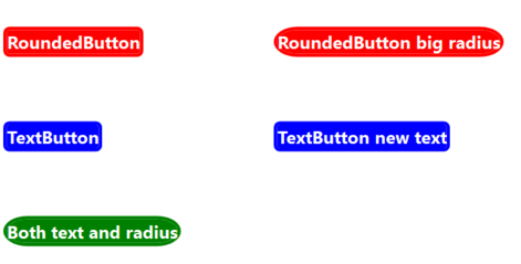
终于开始实施你的建议。它工作得很好(特别是对于一些更复杂的风格控制)。谢谢! – GrantA

1

发生了什么是该样式实际上只有一个TextBlock实例。将样式应用于第二个按钮时,TextBlock实际上会重新添加到新控件。您应该可以通过在TextBlock元素上设置x:Shared="false"来避免这种情况。

+1

不错!您的修补程序有效,但是x:Shared属性只能应用于Style本身,而不能应用于TextBlock元素。但将它应用到Button1Style解决了这个问题。谢谢。 – GrantA

+0

啊呀。 x:共享不会出现太多,所以我不记得确切的用法。当你不期望它时,它肯定会令人发狂。 – Eric

+0

同意。我不记得我是否遇到过之前需要的情况,这就是为什么我被困在了发生的事情上,以及为什么我在网上找不到与我遇到的问题类似的东西。 – GrantA