2016-11-05 73 views
1

我有以下的SVG,我想在移动后在路径上逐像素绘制圆。就像蜗牛走了,他让他身后的条纹。所以我的问题是如何画浅红色的圆圈?
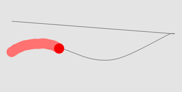
 Snail effect像蜗牛一样的路径上的SVG动画

<svg xmlns="http://www.w3.org/2000/svg" xmlns:xlink="http://www.w3.org/1999/xlink" version="1.1" viewBox="0 0 1000 200" id="svgBox" style="background-color:#e4e4e4"> 
 
    <path d="M3.858,58.607 c16.784-5.985,33.921-10.518,51.695-12.99c50.522-7.028,101.982,0.51,151.892,8.283c17.83,2.777,35.632,5.711,53.437,8.628 c51.69,8.469,103.241,11.438,155.3,3.794c53.714-7.887,106.383-20.968,159.374-32.228c11.166-2.373,27.644-7.155,39.231-4.449L10,10" stroke="grey" stroke-width="1" fill="none" id="animateMotion"/> 
 
    <circle cx="" cy="" r="5" fill="red"> 
 
     <animateMotion dur="6s" repeatCount="0"> 
 
      <mpath xlink:href="#animateMotion"/> 
 
     </animateMotion> 
 
    </circle> 
 
</svg>

回答

3

您可以为实例做这样的事情:

.path { 
 
    stroke-dasharray: 1230; 
 
    stroke-dashoffset: 1230; 
 
    animation: snail 6s linear forwards; 
 
} 


@keyframes snail { 
 
    to { 
 
    stroke-dashoffset: 0; 
 
    } 
 
}
<svg xmlns="http://www.w3.org/2000/svg" xmlns:xlink="http://www.w3.org/1999/xlink" version="1.1" viewBox="0 0 1000 200" id="svgBox" style="background-color:#e4e4e4"> 
 
     <path class="path" d="M3.858,58.607 c16.784-5.985,33.921-10.518,51.695-12.99c50.522-7.028,101.982,0.51,151.892,8.283c17.83,2.777,35.632,5.711,53.437,8.628 c51.69,8.469,103.241,11.438,155.3,3.794c53.714-7.887,106.383-20.968,159.374-32.228c11.166-2.373,27.644-7.155,39.231-4.449L10,10" stroke="pink" stroke-width="12" fill="none" id="animateMotion"/> 
 
     <circle cx="" cy="" r="5" fill="red"> 
 
      <animateMotion dur="6s" repeatCount="0"> 
 
       <mpath xlink:href="#animateMotion"/> 
 
      </animateMotion> 
 
     </circle> 
 
    </svg>

0

也许this article我认为这会给你一些指点,和相连接的例子CodePen here。我削减&粘贴你的路径,并设置ID和线获取绘制按照你的'蜗牛'踪迹'的要求。

下面是导致SVG:

<svg version="1.1" id="Layer_1" xmlns="http://www.w3.org/2000/svg" xmlns:xlink="http://www.w3.org/1999/xlink" x="0px" y="0px" 
    width="340px" height="333px" viewBox="0 0 340 333" enable-background="new 0 0 340 333" xml:space="preserve"> 

     <path class="path" d="M3.858,58.607 c16.784-5.985,33.921-10.518,51.695-12.99c50.522-7.028,101.982,0.51,151.892,8.283c17.83,2.777,35.632,5.711,53.437,8.628 c51.69,8.469,103.241,11.438,155.3,3.794c53.714-7.887,106.383-20.968,159.374-32.228c11.166-2.373,27.644-7.155,39.231-4.449L10,10" stroke="Orange" stroke-width="10" fill="#FFFFFF" stroke-miterlimit="10" id="animateMotion"/> 

    <path class="path" fill="#FFFFFF" stroke="#000000" stroke-width="4" stroke-miterlimit="10" d="M66.039,133.545c0,0-21-57,18-67s49-4,65,8 
    s30,41,53,27s66,4,58,32s-5,44,18,57s22,46,0,45s-54-40-68-16s-40,88-83,48s11-61-11-80s-79-7-70-41 
    C46.039,146.545,53.039,128.545,66.039,133.545z"/> 

</svg> 

而CSS

.path { 
    stroke-dasharray: 1000; 
    stroke-dashoffset: 1000; 
    animation: dash 5s linear alternate infinite; 
} 

@keyframes dash { 
    from { 
    stroke-dashoffset: 1000; 
    } 
    to { 
    stroke-dashoffset: 0; 
    } 
}