2017-07-26 72 views
3

我有一个按钮,我想修复它的位置右侧的div,该按钮切换它的左div的可见性,问题是该按钮丢失它的位置,一旦分辨率正在改变...如何修复div右边的元素?

下面是一个Example

,这里是我到目前为止已经完成:

$('.results_toggle').on('click', function() { 
 
    $(this).toggleClass('left_hide'); 
 
    $('.left').toggle(); 
 
    });
.cont { 
 
     width: 100vw; 
 
    } 


    .left { 
 
     position: relative; 
 
     width: 50vw; 
 
     height: 100vh; 
 
     background-color: grey; 
 
     float: left; 
 
     border-left: 2px solid white; 
 
    } 


    .right { 
 
     height: 100vh; 
 
     width: 50vw; 
 
     float: left; 
 
    } 


    .results_toggle:before { 
 
     content: "\f054"; 
 
     font-family: FontAwesome; 
 
     font-style: normal; 
 
     font-weight: normal; 
 
     text-decoration: inherit; 
 
     color: black; 
 
     font-size: 24px; 
 
     padding-right: 0.5em; 
 
     position: absolute; 
 
     top: 14px; 
 
     left: 5px; 
 
    } 


    .results_toggle { 
 
     background-color: grey; 
 
     height: 60px; 
 
     width: 30px; 
 
     position: absolute; 
 
     z-index: 106; 
 
     top: 45vh; 
 
     right: 223px; 
 
     border-bottom-right-radius: 110px; 
 
     border-top-right-radius: 110px; 
 
     border-bottom: 0; 
 
    } 


    .left_hide { 
 
     left: 0px; 
 
    }
<script src="https://ajax.googleapis.com/ajax/libs/jquery/2.1.1/jquery.min.js"></script> 


     <div class="cont"> 
 
     <div class="left"> 
 
     </div> 
 
     <div class="results_toggle"> 
 
     <!-- the button --> 
 
     </div> 
 
     <div class="right"> 
 
     </div> 
 
    </div>

回答

3

这个最简单的解决办法是将拨动.right格,并在left: 0所以位置它总是与.left div相邻,如下所示:

<div class="cont"> 
    <div class="left"></div> 
    <div class="right"> 
    <div class="results_toggle"></div>  
    </div> 
</div> 
.right { 
    position: relative; /* add this */ 
} 

.results_toggle { 
    /* remove 'right' */ 
    left: 0; /* add this */ 
} 

Working example

这种方法的优点是,它会在屏幕分辨率的任何改变完全不受影响。

+0

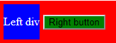
好主意....我马上去做一些检查 – RoyBarOn

+0

这就是我正在寻找的 - 很好的解决方案 - 谢谢! – RoyBarOn

1

不知道,如果这就是你的意思,但我只是将按钮的left属性更改为50vw,与灰色框相同。 Here's a fiddle

编辑: 另一种选择:position: relativefloat: leftleftright财产 updated fiddle

+0

感谢 - 我希望找到一种方法,使按钮浮自然地它的左格......我不想依赖于查看端口位置 – RoyBarOn

+0

感谢您的时间,Rory McCrossan解决方案就是我的目标 - 感谢您的美好愿望! – RoyBarOn

0

这是因为你已经修复了每个属性。

您可以使用absoluterelativeposition修复父项右侧的元素。并添加你的孩子的width

.parent{ 
 
width:200px; 
 
height:200px; 
 
background-color:#ccc; 
 
position:relative; 
 
} 


.child{ 
 
position:absolute; 
 
right:0; 
 
top:100px; 
 
transform:translateX(100%) translateY(-50%); 
 
}
<div class="parent"> 
 
<button class="child">btn</button> 
 
</div>

+0

谢谢 - 但在我的情况 - 按钮是包装div的孩子 - 我希望它的行为像它是它的左边的孩子div – RoyBarOn

1

您使用视窗单位,因此改变视口大小(分辨率),当它们的值会发生变化。

如果你想arrow留在中间(因此,灰色div的右侧),你应该居中下面

见片段这样

$('.results_toggle').on('click', function() { 


    $(this).toggleClass('left_hide'); 
 
    $('.left').toggle(); 


});
.cont { 
 
    width: 100vw; 
 
} 


.left { 
 
    position: relative; 
 
    width: 50vw; 
 
    height: 100vh; 
 
    background-color: grey; 
 
    float: left; 
 
    border-left:2px solid white; 
 
} 


.right { 
 
    height: 100vh; 
 
    width: 50vw; 
 
    float: left; 
 
} 


.results_toggle:before { 
 
     content: "\f054"; 
 
    font-family: FontAwesome; 
 
    font-style: normal; 
 
    font-weight: normal; 
 
    text-decoration: inherit; 
 
    color: black; 
 
    font-size: 24px; 
 
    padding-right: 0.5em; 
 
    position: absolute; 
 
    top: 14px; 
 
    left: 5px; 
 
} 


.results_toggle { 
 
     background-color: grey; 
 
    height: 60px; 
 
    width: 30px; 
 
    position: absolute; 
 
    z-index: 106; 
 
    top: 50%; 
 
    right:50%; 
 
    transform:translate(100%,-50%); 
 
    border-bottom-right-radius: 110px; 
 
    border-top-right-radius: 110px; 
 
    border-bottom: 0; 
 
} 


.left_hide{ 
 
    left:0px; 
 
}
<link href="https://maxcdn.bootstrapcdn.com/bootstrap/3.3.7/css/bootstrap.min.css" rel="stylesheet"/> 
 
<link href="https://maxcdn.bootstrapcdn.com/font-awesome/4.7.0/css/font-awesome.min.css" rel="stylesheet"/> 
 
<script src="https://ajax.googleapis.com/ajax/libs/jquery/2.1.1/jquery.min.js"></script> 
 
<div class="cont"> 
 
    <div class="left"> 


    </div> 
 
    <div class="results_toggle"> 


    </div> 
 
    <div class="right"> 


    </div> 
 
</div>

+0

感谢您的时间,感谢您的好意! – RoyBarOn

1

对我来说,对齐元素的最佳方法是使用Flexbox属性。使用这些属性,您可以将元素作为方框放置在一行,一列...在您的情况下,您有一个主框,包含左侧和右侧。这是与实现Flexbox放置结果:

enter image description here

主要DIV由红色背景表示。里面有你的左边的div,并与你的右键对齐。

这里是使这个代码:

<html> 
<head> 
    <meta charset='utf-8' /> 
    <style type="text/css"> 
    .cont 
    { 
    display: flex; 
    align-items: center; 
    background-color: red; 
    color: white; 
    } 
    .left 
    { 
    background-color: blue; 
    margin: 5px; 
    } 
    button 
    { 
    background-color: green; 
    } 
    </style> 
</head> 
<body> 
    <div class="cont"> 
    <div class="left"> 
    <p>Left div</p> 
    </div> 
    <div class="results_toggle"> 
     <button>Right button</button> 
    </div> 
    <div class="right"></div> 
    </div> 
</body> 
</html> 
+0

感谢您的时间,感谢您的好意! – RoyBarOn