-4
A
回答
1
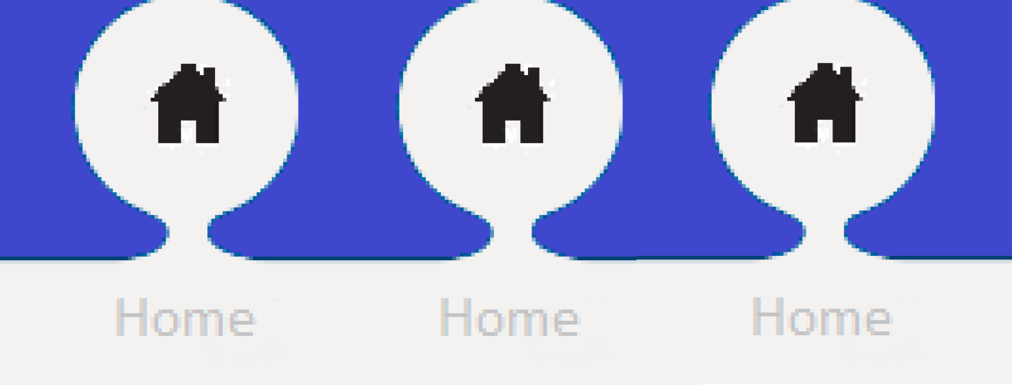
“圈子”,在下面的例子中没有完全相同相同的形状,你的形象。这是可能的,但至少下面的内容会让你开始。
UL.circle-menu {

    list-style: none;

    padding: 0;

}


UL.circle-menu LI {

    display: block;

    float: left;

    width: 115px;

    text-align: center;

    background-color: #3f48cc;

}


UL.circle-menu LI .circle {

    display: block;

    width: 80px;

    height: 80px;

    background-color: white;

    border-radius: 50%;

    margin: 0 auto;

    position: relative;

    top: 2px;

    padding-top: 22px;

    box-sizing: border-box;

}


UL.circle-menu LI .connector {

    display: block;

    width: 30px;

    height: 15px;

    background-color: white;

    margin: 0 auto;

    position: relative;

}


UL.circle-menu LI .connector::before,

UL.circle-menu LI .connector::after {

    content: "";

    display: block;

    position: absolute;

    width: 15px;

    height: 15px;

    background-color: #3f48cc;

    border-radius: 50%;

}


UL.circle-menu LI .connector::before {

    left: -7px;

}


UL.circle-menu LI .connector::after {

    left: 22px;

}


UL.circle-menu LI .menu-text {

    display: inline-block;

    width: 115px;

    background-color: white;

    padding: 10px;

    font-family: sans-serif;

    font-size: 16px;

    color: #c3c3c3;

    box-sizing: border-box;

}
<link rel="stylesheet" href="https://maxcdn.bootstrapcdn.com/font-awesome/4.7.0/css/font-awesome.min.css"/>
<ul class="circle-menu">
<li>
<div class="circle">
<i class="fa fa-home fa-2x" aria-hidden="true"></i>
</div>
<div class="connector"></div>
<div class="menu-text">Home</div>
</li>
<li>
<div class="circle">
<i class="fa fa-home fa-2x" aria-hidden="true"></i>
</div>
<div class="connector"></div>
<div class="menu-text">Home</div>
</li>
<li>
<div class="circle">
<i class="fa fa-home fa-2x" aria-hidden="true"></i>
</div>
<div class="connector"></div>
<div class="menu-text">Home</div>
</li>
</ul>
0
我认为实现这一目标的最好方法是使用SVG滤镜。你正在谈论一个已经存在的效果,它被称为Goo。
.menu{

    filter:url('#shadowed-goo');

    position:absolute;

    left:0;

    padding-top:20px;

    padding-left:50px;

    width:100px;

    height:100px;

    box-sizing:border-box;

    font-size:20px;

    text-align:left;

}

.menu-item{

    border-radius:100%;

    width:80px;

    height:80px;

    position:absolute;

    top:20px;

    text-align:center;

    line-height:80px;

    background:#f62;

    left:10px;

}

.home{

    width:100px;

    position:absolute;

    text-align:center;

    top:113px;

    left:0;

    background:#f62;

    height:100px;

}
<nav class="menu">
<a href="#" class="menu-item"></a>
<div class="home">home</div>
</nav>
<!-- filters -->
<svg xmlns="http://www.w3.org/2000/svg" version="1.1">
<defs>
<filter id="shadowed-goo">
<feGaussianBlur in="SourceGraphic" result="blur" stdDeviation="10" />
<feColorMatrix in="blur" mode="matrix" values="1 0 0 0 0 0 1 0 0 0 0 0 1 0 0 0 0 0 18 -7" result="goo" />
<feGaussianBlur in="goo" stdDeviation="3" result="shadow" />
<feColorMatrix in="shadow" mode="matrix" values="0 0 0 0 0 0 0 0 0 0 0 0 0 0 0 0 0 0 1 -0.2" result="shadow" />
<feOffset in="shadow" dx="1" dy="1" result="shadow" />
<feBlend in2="shadow" in="goo" result="goo" />
<feBlend in2="goo" in="SourceGraphic" result="mix" />
</filter>
<filter id="goo">
<feGaussianBlur in="SourceGraphic" result="blur" stdDeviation="10" />
<feColorMatrix in="blur" mode="matrix" values="1 0 0 0 0 0 1 0 0 0 0 0 1 0 0 0 0 0 18 -7" result="goo" />
<feBlend in2="goo" in="SourceGraphic" result="mix" />
</filter>
</defs>
</svg>卢卡斯Bebber有这个惊人的Codepen serie与SVG过滤完成,并通过CSS应用。
相关问题
- 1. 不规则形状
- 2. CSS中的不规则形状
- 3. 将不规则形状拟合成圆形
- 4. 不规则的矩形形状
- 5. jQuery圆形菜单
- 6. 当新形状在加工时形成不规则形状
- 7. CSS定义形状椭圆
- 8. 使用不规则形状按钮的简单方法
- 9. 获取不规则形状的最佳椭圆拟合
- 10. 错误的圆形菜单
- 11. 圆形到圆形三角形(菜单按钮切换)
- 12. 造型不规则形状的按钮
- 13. 形状不规则的UIBezierPath填充
- 14. PDF中的不规则形状区域
- 15. Android布局中的不规则形状
- 16. CSS/HTML |菜单转换:圆形到方形
- 17. Opengl不规则形状颜色填充
- 18. 不规则形状碰撞检测
- 19. OpenCV - 检测圆形形状
- 20. 带有图形不规则形状的网格
- 21. 在HTML/HTML5中使用JS的不规则锚点和形状
- 22. 将不规则形状裁剪成矩形
- 23. 在不规则形状多边形内获取纬度/深度
- 24. iOS石英2D图形填充不规则形状模糊
- 25. 算法以适应矩形最少到不规则形状
- 26. 使用houghcircle函数检测不规则形状opencv python
- 27. 树形菜单中的圆角
- 28. Flex 3:带有PopUpButton的圆形菜单
- 29. 用圆圈绘制形状
- 30. 用css绘制不规则的形状(应该是响应式的)