0
我试过用3个div制作一个容器,使三个水平排列。中央盒子的左上方和右下方不对齐,第三个盒子远远低于前两个。我对此进行了一些研究,但是我试图做出的改变并没有改变这一点。水平对齐3个div的容器
非常感谢!
Link that shows photo of final page and the issue that I am having
HTML代码:
<div class="container">
<div class="left">
<p>
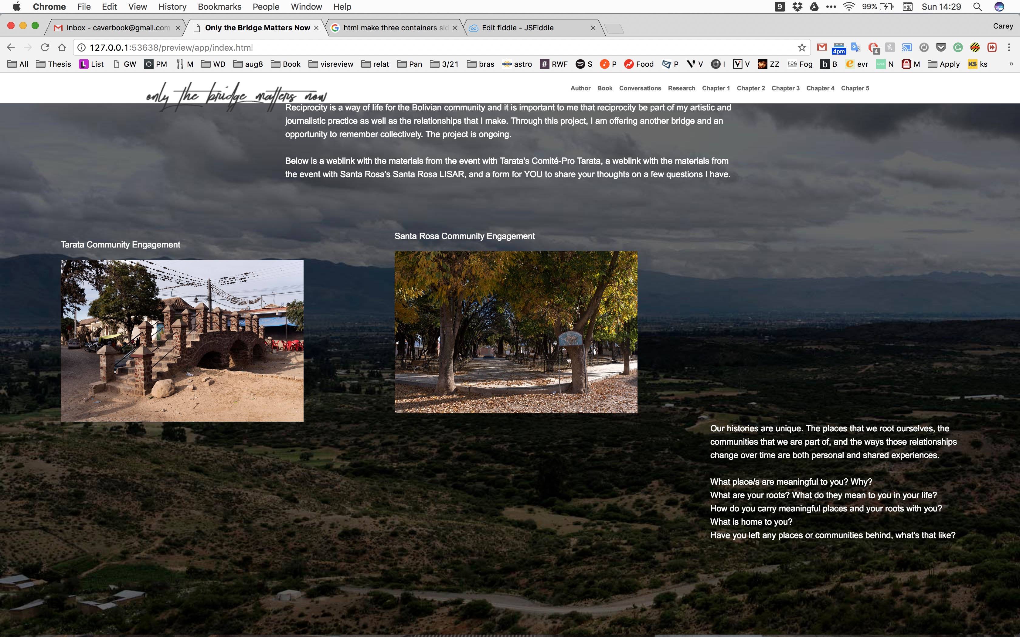
Tarata Community Engagement
</p>
<a href="http://www.onlythebridge.com/?page_id=28" class="tarata" target="_blank"><img src="tarata.jpg" width="400" height="267" alt="Tarata Community Engagement Project" /></a></div>
<div class="center">
<p>
Santa Rosa Community Engagement
</p>
<img src="santa-rosa.jpg" width="400" height="267" alt="Santa Rosa Community Engagement Project" />
</div>
<div class="right">
<p>
Our histories are unique. The places that we root ourselves, the communities that we are part of, and the ways those relationships change over time are both personal and shared experiences.
<br><br>
What place/s are meaningful to you? Why? <br>
What are your roots? What do they mean to you in your life?<br>
How do you carry meaningful places and your roots with you? <br>
What is home to you? <br>
Have you left any places or communities behind, what's that like?
</p></div>
</div>
造型代码在XHTML文档:
.container {
width:100%;
height:100%;
text-align:left;

}
.left {
float: left;
margin-left:100px;
max-width: 300px;

}
.center {
float: center;
margin-left: 650px;
max-width: 300px;

}
.right {
float: right;
margin-right: 100px;
max-width: 410px;

}
??浮动:中心?你在哪里发现这可能是浮动的可能值? –