2
我在HTML的桌面视图中有4列。 当我们切换到移动视图时,我们显示2列和2行(请参阅附图以供参考)。CSS/CSS3切换元素的位置
的代码是:
<div class="sections">
    <div class="one-fourth-col">Column 1</div>
    <div class="one-fourth-col">Column 2</div>
    <div class="one-fourth-col">Column 3</div>
    <div class="one-fourth-col">Column 4</div>
</div>
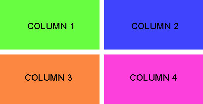
我在手机版中得到的观点是:
我想以下几种观点:
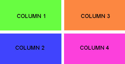
基本上,我想要在第一列中显示#1和#2在左边的mn。 右侧第二列#3和#4。
我在css中使用float:right属性。 我想通过不移动HTML中的元素来处理这个问题。
感谢您的帮助。
@HashemQolami - 它也可以用多列布局完成,甚至 - 只在IE浏览器 - 用网格布局。 – Alohci 2014-09-13 11:24:45