2016-07-06 54 views
3

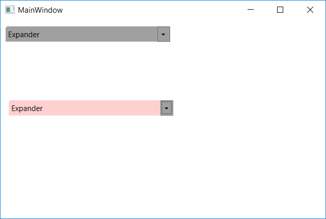
是否可以创建某种基本扩展器样式并覆盖派生样式中标题的背景颜色? 在我的应用程序中,我使用了很多扩展器,并且希望更改标题的背景颜色。我知道我可以复制&粘贴我的风格并编辑颜色,但根据“基本风格”和设置标题的背景颜色创建新样式会更好。 但我不知道如何访问这种颜色。 这是这一行的颜色:下面我想改变(标题中的边框):Border Name =“border”...我无法访问派生样式的setter中的“border”...基本扩展器样式,覆盖标题颜色

这是我的(基地)风格:

<Style TargetType="Expander" x:Key="ExpanderStyle"> 
    <Setter Property="Background" Value="{DynamicResource {x:Static SystemColors.ControlDarkBrushKey}}"/> 
    <Setter Property="Foreground" Value="{DynamicResource {x:Static SystemColors.ControlTextColor}}"/> 
    <Setter Property="Template"> 
     <Setter.Value> 
      <!-- Control template for expander --> 
      <ControlTemplate TargetType="Expander" x:Name="exp"> 
       <Grid> 
        <Grid.RowDefinitions> 
         <RowDefinition Height="Auto"/> 
         <RowDefinition Name="ContentRow" Height="0"/> 
        </Grid.RowDefinitions> 
        <Border Name="border" Grid.Row="0" Background="{DynamicResource {x:Static SystemColors.ControlDarkBrushKey}}" BorderThickness="1" CornerRadius="4,4,0,0" > 
         <Grid> 
          <Grid.ColumnDefinitions> 
           <ColumnDefinition Width="*" /> 
           <ColumnDefinition Width="20" /> 
          </Grid.ColumnDefinitions> 
          <ToggleButton x:Name="tb" FontFamily="Marlett" FontSize="9.75" Background="{DynamicResource {x:Static SystemColors.ControlDarkBrushKey}}" Foreground="Black" Grid.Column="1" Content="u" IsChecked="{Binding Path=IsExpanded,Mode=TwoWay,RelativeSource={RelativeSource TemplatedParent}}" /> 
          <ContentPresenter x:Name="HeaderContent" Grid.Column="0" Margin="4" ContentSource="Header" RecognizesAccessKey="True" /> 
         </Grid> 
        </Border> 
        <Border x:Name="Content" Grid.Row="1" BorderThickness="1,0,1,1" CornerRadius="0,0,4,4" > 
         <ContentPresenter Margin="4" /> 
        </Border> 
       </Grid> 
       <ControlTemplate.Triggers> 
        <Trigger Property="IsExpanded" Value="True"> 
         <Setter TargetName="ContentRow" Property="Height" Value="{Binding ElementName=Content,Path=Height}" /> 
         <Setter Property="Content" TargetName="tb" Value="t"></Setter> 
        </Trigger> 
       </ControlTemplate.Triggers> 
      </ControlTemplate> 
     </Setter.Value> 
    </Setter> 
</Style> 

我愿做这样的事情:

<Style x:Key="ExpanderStyleRed" BasedOn="{StaticResource ExpanderStyle}" TargetType="Expander"> 
      <Setter Property="???" Value="Red"/> 
<Style> 

回答

1

使用TemplateBinding

 <Style TargetType="Expander" x:Key="ExpanderStyle"> 
     <Setter Property="Background" Value="{DynamicResource {x:Static SystemColors.ControlDarkBrushKey}}"/> 
     <Setter Property="Foreground" Value="{DynamicResource {x:Static SystemColors.ControlTextColor}}"/> 
     <Setter Property="Template"> 
      <Setter.Value> 
       <!-- Control template for expander --> 
       <ControlTemplate TargetType="Expander" x:Name="exp"> 
        <Grid> 
         <Grid.RowDefinitions> 
          <RowDefinition Height="Auto"/> 
          <RowDefinition Name="ContentRow" Height="0"/> 
         </Grid.RowDefinitions> 
         <Border Name="border" Grid.Row="0" Background="{TemplateBinding Background}" BorderThickness="1" CornerRadius="4,4,0,0" > 
          <Grid> 
           <Grid.ColumnDefinitions> 
            <ColumnDefinition Width="*" /> 
            <ColumnDefinition Width="20" /> 
           </Grid.ColumnDefinitions> 
           <ToggleButton x:Name="tb" FontFamily="Marlett" FontSize="9.75" Background="{DynamicResource {x:Static SystemColors.ControlDarkBrushKey}}" Foreground="Black" Grid.Column="1" Content="u" IsChecked="{Binding Path=IsExpanded,Mode=TwoWay,RelativeSource={RelativeSource TemplatedParent}}" /> 
           <ContentPresenter x:Name="HeaderContent" Grid.Column="0" Margin="4" ContentSource="Header" RecognizesAccessKey="True" /> 
          </Grid> 
         </Border> 
         <Border x:Name="Content" Grid.Row="1" BorderThickness="1,0,1,1" CornerRadius="0,0,4,4" > 
          <ContentPresenter Margin="4" /> 
         </Border> 
        </Grid> 
        <ControlTemplate.Triggers> 
         <Trigger Property="IsExpanded" Value="True"> 
          <Setter TargetName="ContentRow" Property="Height" Value="{Binding ElementName=Content,Path=Height}" /> 
          <Setter Property="Content" TargetName="tb" Value="t"></Setter> 
         </Trigger> 
        </ControlTemplate.Triggers> 
       </ControlTemplate> 
      </Setter.Value> 
     </Setter> 
    </Style> 

    <Style x:Key="ExpanderStyleRed" BasedOn="{StaticResource ExpanderStyle}" TargetType="Expander"> 
     <Setter Property="Background" Value="#2fff0000"/> 
    </Style> 

然后:

<Grid> 

    <Expander x:Name="expander1" Style="{DynamicResource ExpanderStyle}" Header="Expander" HorizontalAlignment="Left" VerticalAlignment="Top" Margin="7,10,0,0" Height="108"> 
     <TextBlock Width="250" Height="150" TextWrapping="Wrap"> 
      asklsaklsa saaskklsaklas alsaklalkjd 
      asklsaklsaklsa saklsaklsakl jsajkjska 
      saklsaklsakl sasa 
     </TextBlock> 
    </Expander> 

    <Expander x:Name="expander2" Style="{DynamicResource ExpanderStyleRed}" Header="Expander" HorizontalAlignment="Left" VerticalAlignment="Top" Margin="12,126,0,0" Height="133"> 
     <TextBlock Width="250" Height="150" TextWrapping="Wrap"> 
      asklsaklsa saaskklsaklas alsaklalkjd 
      asklsaklsaklsa saklsaklsakl jsajkjska 
      saklsaklsakl sasa 
     </TextBlock> 
    </Expander> 

</Grid> 

enter image description here