2017-07-24 94 views
7

Star with four points4圆角点星形

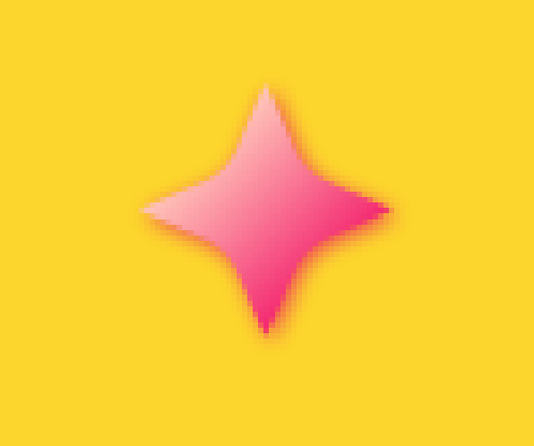
我想获得完美尽可能在CSS这个明星的像素,这里是我的尝试,到目前为止,但它是一个5倾斜的明星,我想只有4中还有我怎样才能让角落变得圆润?

#star-five { 
 
    margin: 50px 0; 
 
    position: relative; 
 
    display: block; 
 
    color: red; 
 
    width: 0px; 
 
    height: 0px; 
 
    border-right: 100px solid transparent; 
 
    border-bottom: 70px solid red; 
 
    border-left: 100px solid transparent; 
 
    -moz-transform: rotate(35deg); 
 
    -webkit-transform: rotate(35deg); 
 
    -ms-transform:  rotate(35deg); 
 
    -o-transform:  rotate(35deg); 
 
} 
 
#star-five:before { 
 
    border-bottom: 80px solid red; 
 
    border-left: 30px solid transparent; 
 
    border-right: 30px solid transparent; 
 
    position: absolute; 
 
    height: 0; 
 
    width: 0; 
 
    top: -45px; 
 
    left: -65px; 
 
    display: block; 
 
    content: ''; 
 
    -webkit-transform: rotate(-35deg); 
 
    -moz-transform: rotate(-35deg); 
 
    -ms-transform:  rotate(-35deg); 
 
    -o-transform:  rotate(-35deg); 


} 
 
#star-five:after { 
 
    position: absolute; 
 
    display: block; 
 
    color: red; 
 
    top: 3px; 
 
    left: -105px; 
 
    width: 0px; 
 
    height: 0px; 
 
    border-right: 100px solid transparent; 
 
    border-bottom: 70px solid red; 
 
    border-left: 100px solid transparent; 
 
    -webkit-transform: rotate(-70deg); 
 
    -moz-transform: rotate(-70deg); 
 
    -ms-transform:  rotate(-70deg); 
 
    -o-transform:  rotate(-70deg); 
 
    content: ''; 
 
}
<div id="star-five"></div>

+4

SVG是去这里的方式......其他任何东西都会** wayyy **变得复杂。 –

回答

9

也许你可以在Black Four Pointed Star的Unicode字符使用渐变:

它有一些兼容性问题(主要由text-fill-color造成的),但根据您的要求,它可以完成工作。

.four-point-star::after, 
 
.four-point-star::before { 
 
    position: absolute; 
 
    top: 0; 
 
    left: 0; 
 
    content: "\2726"; 
 
    font-size: 12rem; 
 
} 


.four-point-star::after { /* The foreground star */ 
 
    background: linear-gradient(135deg, rgba(255,191,183,1) 20%, rgba(243,44,117,1) 70%); 
 
    -webkit-background-clip: text; 
 
    -webkit-text-fill-color: transparent; 
 
} 


.four-point-star::before { /* The star shadow */ 
 
    color: transparent; 
 
    text-shadow: 2px 3px 10px rgba(242, 96, 85, 1); 
 
} 


/* Demo styling */ 
 
body { 
 
    background: #fbd629; 
 
    padding: 0 2rem; 
 
} 


.four-point-star { 
 
    position: relative; 
 
}
<span class="four-point-star"></span>

+2

太棒了!另外我会为IE做一些备用,并且会很完美。 –

1

我会建议一个SVG。如果你不想为SVG文件另一个HTTP请求,您可以包含在“内容”属性的SVG代码:

content: url("data:image/svg+xml; utf8, <svg.. code here</svg>");

.star-4-point { 
 
    background: url("data:image/svg+xml; utf8,<svg version='1.1' id='Layer_1' xmlns='http://www.w3.org/2000/svg' xmlns:xlink='http://www.w3.org/1999/xlink' x='0px' y='0px' width='50px' height='50px' viewBox='0 0 50 50' style='enable-background:new 0 0 50 50;' xml:space='preserve'><path d='M25,50c0,0,1.325-8.413,8.957-16.043C41.587,26.325,50,25,50,25l0,0c0,0-8.413-1.325-16.043-8.957C26.325,8.413,25,0,25,0 l0,0c0,0-1.325,8.413-8.957,16.043C8.413,23.675,0,25,0,25l0,0c0,0,8.413,1.325,16.043,8.957C23.675,41.588,25,50,25,50'/></svg>"); 
 
    height: 50px; 
 
    width: 50px; 
 
}
<div class="star-4-point"></div>

+6

你最好为你的SVG添加代码,因为你可以给每个[tag:css-shapes]问题提供相同的答案,它根本没有帮助。 –

+0

1)不幸的是,除了Chrome浏览器(Firefox,IE,Edge)以外,其他位置都不显示。 2)你可以像Jordi Nebot一样向SVG添加渐变效果吗? –

+1

现在在Chrome&FF中工作,还没有测试IE或Edge。 –

1

你可以得到四点星星使用两个旋转和倾斜的矩形。

body { 
 
    /* just styles for demo */ 
 
    background-color: #fdd700; 
 
} 


.four-point-star { 
 
    width: 100px; 
 
    height: 100px; 
 
    position: relative; 
 
    margin-top: 100px; 
 
    margin-left: 100px; 
 
} 


.four-point-star:before, 
 
.four-point-star:after { 
 
    content: ""; 
 
    position: absolute; 
 
    background-color: #fa5b88; 
 
    display: block; 
 
    left: 0; 
 
    width: 141.4213%; /* 100% * √2 */ 
 
    top: 0; 
 
    bottom: 0; 
 
    border-radius: 5%; 
 
    transform: rotate(66.66deg) skewX(45deg); 
 
} 


/* the same but +90deg to rotate */ 
 
.four-point-star:after { 
 
    transform: rotate(156.66deg) skew(45deg); 
 
}
<div class="four-point-star"></div>

+0

感谢您的努力!上面的其他人发布了一个更简单和像素完美的方式,虽然 – Panic

+0

@Panic好的,没问题。 –

2

显然,对于这种形状,内联SVG将是最简单和最跨浏览器的解决方案(和一个负责任的像素完美输出)。
下面是一个简单的内联SVG代码使四角星用渐变填充:

svg{ 
 
    display:block; margin:0 auto; 
 
    width:30%; height:auto; 
 
} 
 
/* For the demo */ body{background: url('https://farm8.staticflickr.com/7187/6895047173_d4b1a0d798.jpg');background-size:cover;}
<svg viewbox="0 0 10 10"> 
 
    <defs> 
 
    <linearGradient id="starGrad"> 
 
     <stop offset="0%" stop-color="rgb(153,218,255)" /> 
 
     <stop offset="100%" stop-color="rgb(0,128,128)"/>  
 
    </linearGradient> 
 
    </defs> 
 
    <path fill="url(#starGrad)" d="M5 1 Q5.8 4.2 9 5 Q5.8 5.8 5 9 Q4.2 5.8 1 5 Q4.2 4.2 5 1z" /> 
 
</svg>

四点与路径元素制成,使用quadratic bezier curves。这颗星星充满了SVG linear gradient