我希望你能使用EventTrigger,但只有他们工作为路由事件。您将使用的事件“IsEnabledChanged”,是而不是路由事件,因此您无法使用EventTrigger。但是,还有另一种方法,您可以使用VisualStateManager并为“禁用”和“正常”状态提供您自己的动画。
代替使用VisualStateManager,您可以在代码隐藏中执行动画,并且可能已经声明了您自己的自定义RoutedEvent。我的解决方案使用VisualStateManager,具有完全在XAML中执行的优点。
要使用VisualStateManager,您将创建一个带有ControlTemplate的样式,但我的研究尚未发现任何其他方式。这要求您构建大部分按钮的显示功能。这里是我的样品的启用和禁用状态的屏幕截图:
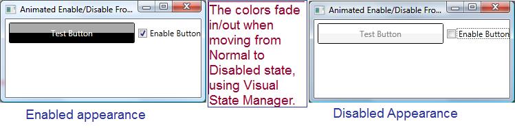
为了模拟普通按钮的外观,我用了两个矩形,一个上面另一方面,该按钮的外观。看上面的左边:你看到按钮的深灰色顶部,它来自我的一个矩形,黑底部分来自我的另一个矩形。右侧禁用的外观使用相同的两个矩形,但动画会将颜色更改为白色和白色烟雾。我为每个矩形提供一个ColorAnimation。
下面是使用VisualStateManager风格:
<Window.Resources>
    <Style TargetType="Button" x:Key="AnimatedStyle" >
     <Setter Property="Template">
      <Setter.Value>
       <ControlTemplate TargetType="Button">
        <!-- Define our button's border. Note that
         the text color is inherited by child
         elements, that is we give it a name, so
         we can target it with the animation -->
        <Border BorderBrush="Black" BorderThickness="1"
          CornerRadius="2"
          TextBlock.Foreground="WhiteSmoke"
          Name="theBorder">
         <Grid>
          <Grid.RowDefinitions>
           <RowDefinition />
           <RowDefinition />
          </Grid.RowDefinitions>

          <!-- To match the appearance of a typical button,
           we use two rectangles -->
          <Rectangle Name="topBackground" Fill="DarkGray"/>
          <Rectangle Grid.Row="1" Name="bottomBackground"
             Fill="Black" />

          <!-- The content presenter shows the
            button's text -->
          <ContentPresenter Grid.RowSpan="2"
             VerticalAlignment="Center"
             HorizontalAlignment="Center" />
         </Grid>
         <VisualStateManager.VisualStateGroups>
          <VisualStateGroup Name="CommonStates">

           <!-- Here is where we define
            the disable animation -->
           <VisualState Name="Disabled">
            <Storyboard>
             <ColorAnimation
               Storyboard.TargetName="topBackground"
               Storyboard.TargetProperty="(Rectangle.Fill).(Color)"
               To="White" Duration="0:0:.5" />
             <ColorAnimation
               Storyboard.TargetName="bottomBackground"
               Storyboard.TargetProperty="(Rectangle.Fill).(Color)"
               To="WhiteSmoke" Duration="0:0:0.5" />
             <ColorAnimation
               Storyboard.TargetName="theBorder"
               Storyboard.TargetProperty="(TextBlock.Foreground).(Color)"
               To="Gray" Duration="0:0:0.5" />
            </Storyboard>
           </VisualState>

           <!-- Here is where the enabled animation
            is defined -->
           <VisualState Name="Normal">
            <Storyboard>
             <ColorAnimation
               Storyboard.TargetName="topBackground"
               Storyboard.TargetProperty="(Rectangle.Fill).Color"
               To="DarkGray" Duration="0:0:0.5" />
             <ColorAnimation
               Storyboard.TargetName="bottomBackground"
               Storyboard.TargetProperty="(Rectangle.Fill).(Color)"
               To="Black" Duration="0:0:0.5" />
             <ColorAnimation
               Storyboard.TargetName="theBorder"
               Storyboard.TargetProperty="(TextBlock.Foreground).Color"
               To="WhiteSmoke" Duration="0:0:0.5" />
            </Storyboard>
           </VisualState>
          </VisualStateGroup>
         </VisualStateManager.VisualStateGroups>
        </Border>
       </ControlTemplate>
      </Setter.Value>
     </Setter>
    </Style>
</Window.Resources>
下面是一些XAML利用风格和演示动画的运动:
<Grid>
    <!--The button uses the style from above. Note that we control
     whether it is enabled by binding the Enabled property to the checkbox's
     property 'IsChecked', that way we don't need
     any code-behind -->
    <Button Content="Test Button" Name="btnTest"
      IsEnabled="{Binding ElementName=chkEnabled,Path=IsChecked}"
      Height="30" Margin="5"
      Click="btnTest_Click"
      Style="{StaticResource AnimatedStyle}" />

    <CheckBox Grid.Column="1" Content="Enable Button"
       Name="chkEnabled" IsChecked="True" VerticalAlignment="Center" />

    <Grid.ColumnDefinitions>
     <ColumnDefinition />
     <ColumnDefinition Width="auto" />
    </Grid.ColumnDefinitions>
</Grid>
最后,只是为了证明按钮真正禁用/启用,这里是整个代码隐藏(除了锅炉代码),它是通过点击按钮触发的,但只有当它启用时:
private void btnTest_Click(object sender, RoutedEventArgs e) {
     MessageBox.Show("You clicked the button, it must be enabled.");
    }
这是工作,但我想使用ColorAnimation。有没有办法使用它与数据触发器,而不是与EventTrigger)? –