2016-01-24 118 views
1

好吧,这是我的基本的网站结构:HTML5/CSS全高布局

<body> 
    <div id="wrapper"> 
     <header><a href="/"> </a></header> 
     <nav> 
      <ul> 
       <li><a href="...">...</a></li> 
       <li><a href="...">...</a></li> 
       <li><a href="...">...</a></li> 
      </ul> 
     </nav> 
     <div id="content"></div> 
     <footer><a href="/"> </a></footer> 
    </div> 
</body> 

这里是我的CSS基础知识:

html 
{ 
    font-size: 100%; 
    height: 100%; 
    line-height: 1.4; 
    overflow-y: scroll; 
} 

body 
{ 
    background: #EEE url("../images/background.png") repeat-y center center fixed; 
    color: #333; 
    height: 100%; 
    font: 1em 'Lato-Regular'; 
    margin: 0; 
    padding: 0; 
} 

#wrapper 
{ 
    height: 100%; 
    margin: 0 auto; 
    width: 960px; 
} 

#content 
{ 
    min-height: 460px; 
    height: auto !important; 
    height: 460px; 
    margin: 20px 0; 
} 

这是我想达到的目的(不使用javascript hacks,最好):

  1. 页眉和页脚高度由其内容大小决定。
  2. div#content应该有一个X像素的最小高度,但另外扩大尽可能多的,因为它想包括页面的内容。
  3. div#wrapper应伸展以填充整个视口高度,div#content是可伸缩的柔性部分。
  4. 我试图尽可能多的浏览器,但我没有真正进入完整的跨浏览器兼容性。让我们的旧浏览器死亡。

我越来越怪异的结果:

enter image description here

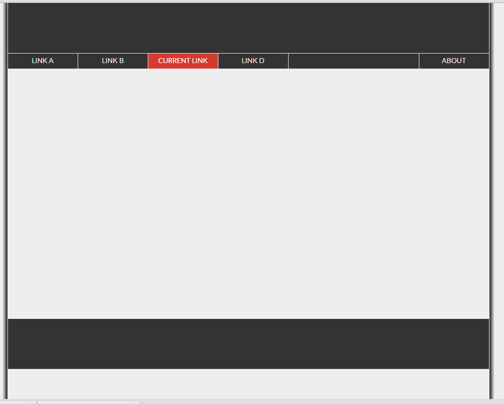
正如你所看到的,包装不拉伸,以填补浏览器窗口,并通过后果,页脚(黑条上底部)浮在页面的中间。 你能帮我吗?

+0

你能创建的jsfiddle?用你提供的代码我不能重新创建它。 –

+0

那是因为你没有任何内容......相信我,当你填充300行内容时,它会没事的。内容属性,最小高度,高度和高度都是无用的...默认情况下,高度是自动的,因为它填充容器的内容。 –

+0

你可以设置'body'的背景以匹配你的'footer',这样你就不会在你的页脚下看到更轻的背景。然后将较亮的背景移到你的'#内容“。 – Rafi

回答

4

display:flex;是容易nowdays (除了它看起来很像这个问题Fill remaining vertical space with CSS using display:flex

html 
 
{ 
 
    font-size: 100%; 
 
    height: 100%; 
 
    line-height: 1.4; 
 
    overflow-y: scroll; 
 
} 


body 
 
{ 
 
    background: #EEE url("../images/background.png") repeat-y center center fixed; 
 
    color: #333; 
 
    height: 100%; 
 
    font: 1em 'Lato-Regular'; 
 
    margin: 0; 
 
    padding: 0; 
 
} 


#wrapper 
 
{ 
 
    height: 100%; 
 
    margin: 0 auto; 
 
    width: 960px; 
 
    display:flex; 
 
    flex-direction:column 
 
} 


#content 
 
{ 
 
    flex:1; 
 
    margin: 20px 0; 
 
/* overflow:auto; add this and it will show a scrollbar when needed and won't push footer down */ 
 
} 
 
footer,header { 
 
    background:lightgray; 
 
    /* no need to set any height, a min-height eventually */
<div id="wrapper"> 
 
     <header><a href="/">header</a></header> 
 
     <nav> 
 
      <ul> 
 
       <li><a href="...">...</a></li> 
 
       <li><a href="...">...</a></li> 
 
       <li><a href="...">...</a></li> 
 
      </ul> 
 
     </nav> 
 
     <div id="content"></div> 
 
     <footer><a href="/">footer</a></footer> 
 
    </div>

+0

是的,但flexbox布局模块不支持在IE8和IE9 :( –

+0

@ Nasco.Chachev阅读OP的要求(*的最后一句特别是*)的#4;) –

+0

@ GabyakaG.Petrioli是我读过的男人它。我在同样的观点,让旧的浏览器死亡:但是,我只是说,flexbox尚未完全支持..没有仇恨tho :) –

0

有一个单元的高度和宽度随css3附带,许多人并不真正使用或知道。 vw和vh表示视口宽度和视口高度。你应该使用它们。如果你想让你的其中一个div获得完整的高度,那么设置高度:100vh,如果它是一个图像,并且你不希望它被垂直压缩,则将宽度设置为:auto。我使用vw和vh很多。最大的,甚至字体大小,我将使用font-size:2vw或类似的东西,1.6或另一个十进制,这样无论设备的宽度如何,它总是2视口宽度(2vw)。玩弄它,你会发现正确的尺寸。设置页脚和导航设置为vh或vw,并且它们将与您正在使用的任何设备保持相称。