0
我想制作一个纸质计算器,它工作正常,但是有一个设计问题。移动输入框宽度不均
输入框在电脑屏幕上正确显示,即使在响应选项(您可以选择屏幕大小),但在实际的手机上,输入框没有相同的宽度。
HTML代码:
<div class="container-fluid">
<div id = "case_one" class="calcoptions sizemod">
<h5>1. To find the weight (in <b>Kilograms</b>) of a ream containing 500 sheets of a given size in <b>inches</b> and <b>Gram-Weight.</b></h5>
<br>
Length: <input type="number" step="0.01" name="length_in" id="txt_weight" placeholder="Length(inch)" style = "width:auto;" min="0" onkeyup="calculateWeightInInches();">
<br><br>
Width: <input type="number" style = "width:auto;" step="0.01" name="width_in" id="txt_width" placeholder="Width(inch)" min="0" max='300' onkeyup="calculateWeightInInches();">
<br><br>
GSM: <input type="number" style = "width:auto;" min="5" max="800" step="0.01" name="length_in" id="txt_GSM" placeholder="GSM" onkeyup="calculateWeightInInches();">
<br><br>
Weight: <input type="number" style = "width:auto;" step = "0.01" name="Weight_Kg" id = "txt_Result" readonly="readonly">
<br><br>
</div>
CSS:
::-webkit-input-placeholder {


text-align: center;
}

:-moz-placeholder { /* Firefox 18- */
    text-align: center;
}

::-moz-placeholder { /* Firefox 19+ */
    text-align: center;
}

:-ms-input-placeholder {
    text-align: center;
}

input[type=number]::-webkit-inner-spin-button,
input[type=number]::-webkit-outer-spin-button {
    -webkit-appearance: none;
    -moz-appearance: none;
    appearance: none;
    margin: 0;
}

input[type='number'] {
    -moz-appearance:textfield;
}

@media only screen and (max-width: 900px) {
    .sizemod {
    display: none;


    }
}

@media (min-width: 858px) {
    html {
     font-size: 12px;
    }
}

@media (min-width: 780px) {
    html {
     font-size: 11px;
    }
}

@media (min-width: 702px) {
    html {
     font-size: 10px;
    }
}

@media (min-width: 724px) {
    html {
     font-size: 9px;
    }
}

@media (max-width: 623px) {
    html {
     font-size: 8px;
    }
}

select {
     font-family: Arial, sans-serif;
     font-size: 10px;
     /*font-style: italic;*/
    }
    select#fixed {
     -webkit-appearance: none;
    }

textarea {
    width: 20px;
};

input[type="number"] {
    width: 20px;
};
在PC: 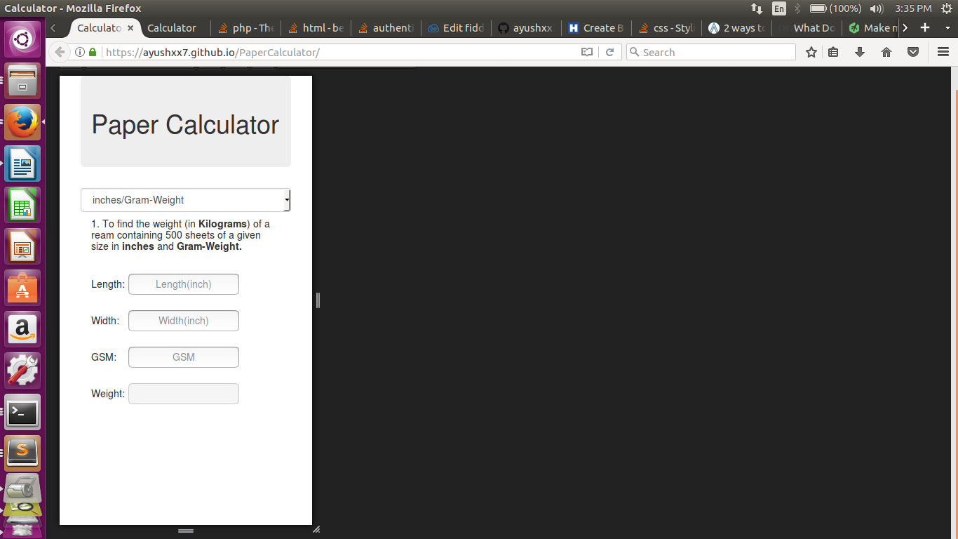
在实际手机: 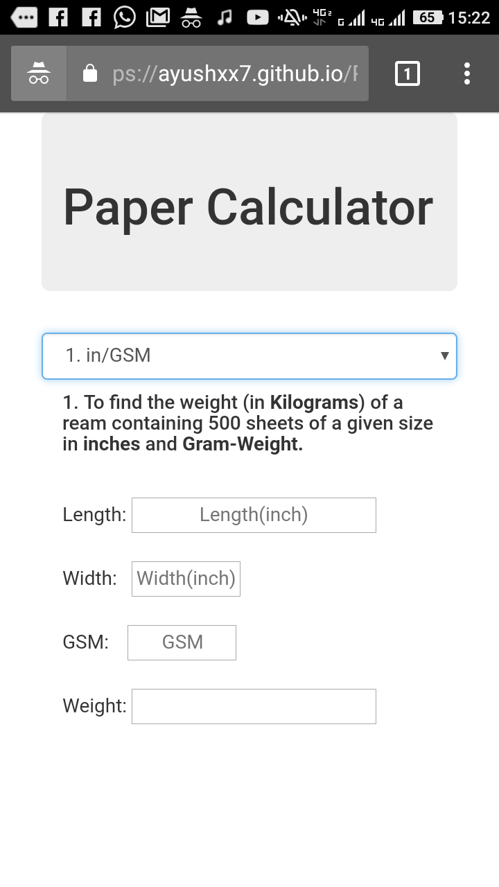
附: style = width:auto;标签刚刚添加,没有工作。
你完全错了,如果你期望'width:auto'会达到你想要的。你希望他们都是相同的宽度 - 那么你将不得不在某处指定宽度。 – CBroe
我会建议使用80%的相对宽度作为输入字段。这样你就可以使它依赖于你可以在media querie中调整的container-div'case_one'。进一步在像素中添加最大宽度以将相对宽度限制为您喜欢的大小。 'input {width:80%;最大宽度:200px;}' 也不知道你想如何地址字段,但如果你做的名字请注意,你命名的第一和第三个领域一样:length_in – mikesp