2016-05-14 130 views
2

当浏览器的宽度600px的下变,我想这样的位置变化,多亏了媒体查询:交换DIV位置

enter image description here

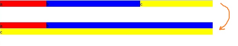
看来,这将需要交换的div位置。这可能与CSS?

* { padding: 0; margin: 0; } 
 
#a { float: left; background-color: red; width: 150px; } 
 
#b { background-color: blue; } 
 
#c { float: right; width: 40%; background-color: yellow; } 
 
@media (max-width: 600px) { 
 
     /* ... */ 
 
}
<div> 
 
    <div id="a">a</div> 
 
    <div id="c">c</div> 
 
    <div id="b">b</div> 
 
</div>

回答

2

你只需要重置浮动或width属性。

在处理浮动和非浮动元素时,不要介意BFC块格式化上下文。

http://www.sitepoint.com/understanding-block-formatting-contexts-in-css/

* { 
 
    padding: 0; 
 
    margin: 0; 
 
} 
 
#a { 
 
    float: left; 
 
    background-color: red; 
 
    width: 150px; 
 
} 
 
#b { 
 
    background-color: blue; 
 
} 
 
#c { 
 
    float: right; 
 
    width: 40%; 
 
    background-color: yellow; 
 
} 
 
@media (max-width: 600px) { 
 
    #c {  
 
    width: 100%; 
 
    } 
 
}
<div> 
 
    <div id="a">a float</div> 
 
    <div id="c">c float or not</div> 
 
    <div id="b">b</div> 
 
</div>

+0

谢谢,太棒了! – Basj

+0

这是我最后一个问题@GCyrillyus:http://stackoverflow.com/questions/37239774/full-width-input-in-a-div ...也许你会有一个想法:) – Basj

+0

@Basj看到迪帕斯的答案从http://codepen.io/gcyrillus/pen/WwWPwP/更新应该做你最终寻找的东西 –

2

是的,这可能与CSS。实际上,Flexbox非常容易,专为这样的任务而设计。

* { 
 
    padding: 0; 
 
    margin: 0; 
 
} 


#container { 
 
    display: flex;     /* establish flex container */ 
 
} 


#a { 
 
    flex: 0 0 150px;     /* don't grow, don't shrink, fixed at 150px width */ 
 
    background-color: red; 
 
} 
 
#b { 
 
    flex: 1;       /* consume all available free space in the row */ 
 
    background-color: aqua; 
 
} 
 
#c { 
 
    flex: 0 0 40%;     /* don't grow, don't shrink, fixed at 40% width */ 
 
    background-color: yellow; 
 
} 
 
@media (max-width: 600px) { 
 
    #container { flex-wrap: wrap; }  /* allow flex items to wrap */ 
 
    #b { flex-basis: calc(100% - 150px); } /* take full width less width of #a */ 
 
    #c { flex-grow: 1; }     /* consumer all available free space in the row */ 
 
}
<div id="container"><!-- children ordered chronologically; no need to reverse order --> 
 
    <div id="a">a</div> 
 
    <div id="b">b</div> 
 
    <div id="c">c</div> 
 
</div>


要了解更多关于Flexbox的访问:


优点:

  1. 最少的代码;非常有效的
  2. centering, both vertically and horizontally, is simple and easy
  3. equal height columns are simple and easy
  4. multiple options for aligning flex elements
  5. 它的响应
  6. 不像花车和表格,其提供有限的布局能力,因为他们从来没有用于建筑布局,Flexbox将是具有现代(CSS3)技术广泛的选择。

浏览器支持:

Flexbox将被所有主流浏览器,支持except IE 8 & 9。一些最新的浏览器版本,例如Safari 8和IE10,需要vendor prefixes。要快速添加所需的所有前缀,请使用Autoprefixer。更多详情,请点击this answer